FRANCESCO IANDOLO WINERY
Brand Strategy · Visual Identity · Website · Photography · Art Direction
Piedmont, Italy · 2017 → ongoing
A mathematician planted a vineyard in the hills of Piedmont. Today, ninety-six points in Forbes.
The Challenge
Francesco didn’t grow up in a vineyard. He came to it by choice, at the top of his professional career, leaving a path he was secure in, because he felt a need to slow down and reconnect with the land. Hands in the soil. The scent of cut grass. The patience of ancient farming.
He started in 2017, first on the land itself. The company followed in 2018 in Monferrato Astigiano and the Colli Tortonesi, working two indigenous grapes of Piedmont: Barbera and Timorasso. Two wines. One red, Nizza. One white, Derthona. The philosophy was subtraction from the beginning: minimal intervention in the vineyard, minimal intervention in the cellar, attention to what nature itself was already saying.
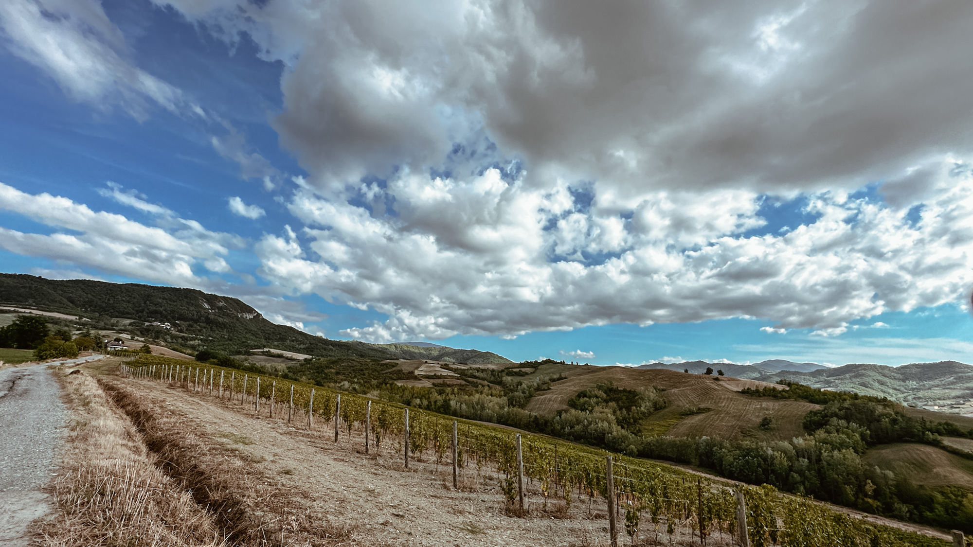
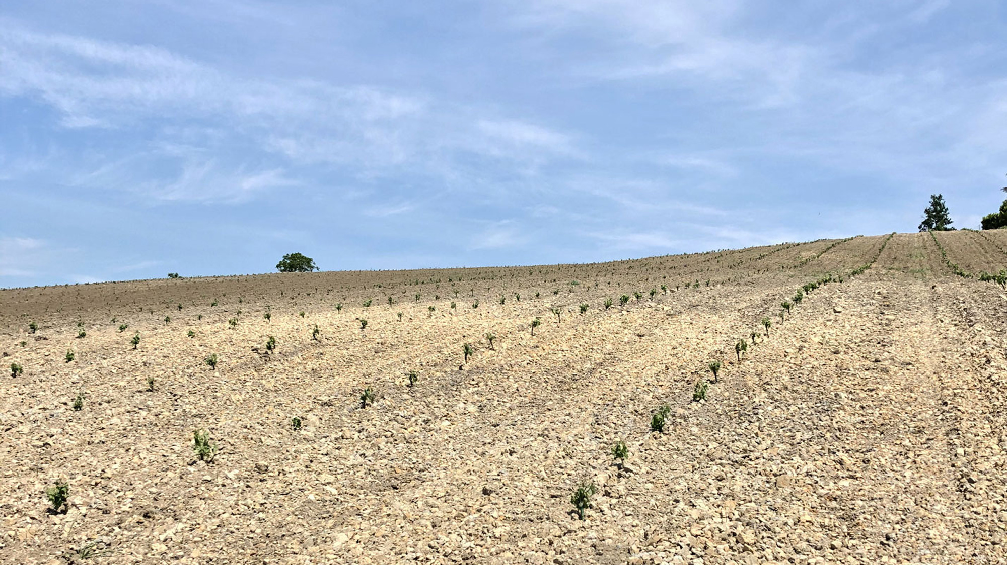
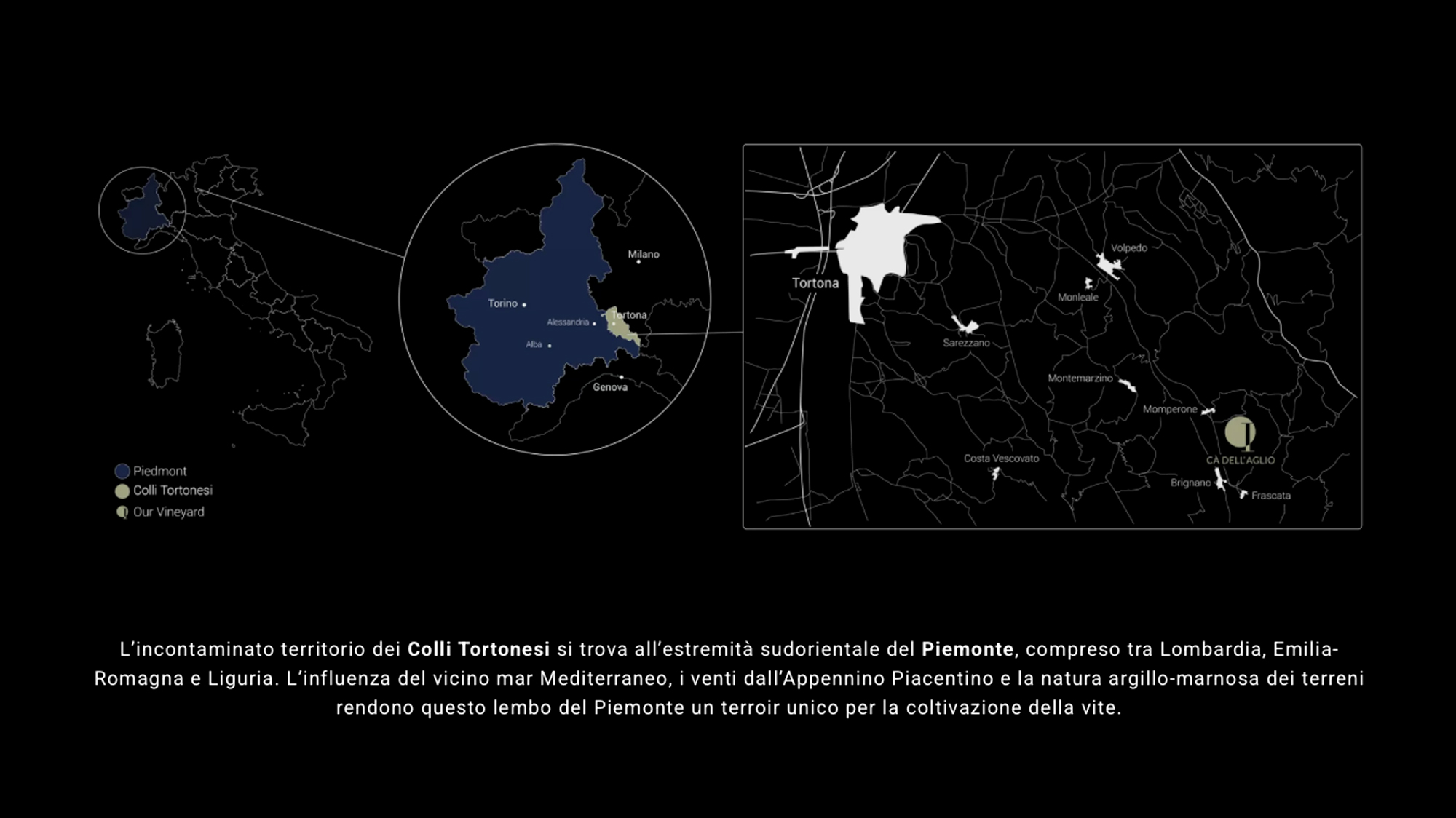
Years later he made the harder choice. He let the Barbera go. He focused entirely on Timorasso in the Colli Tortonesi, an uncontaminated terroir at the south-eastern edge of Piedmont, where the Mediterranean influence and the clay-marl soils give the grape a unique voice.
We started building the brand before the first vintage was bottled. No label yet, no website, no first review. Just a man who had chosen the land, a vineyard being planted, and a question I asked him at the start: “What do you want this wine to mean to the person who finds it?”
His answer became the brand. Essentiality. No forcing. No trends. Letting the place speak for itself.
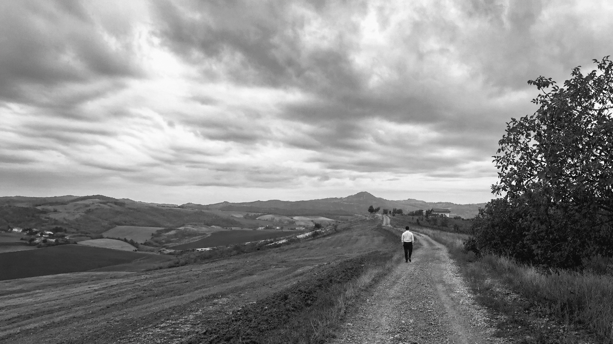
“Before designing anything, I had to understand the land. The brand had to come from the soil, not from a moodboard.”
What I Built
The brand was built before the first bottle. Together, from the start.
Brand strategy and positioning.
A single, clear philosophy drawn from how Francesco actually farms: essentiality, subtraction, respect for the land. The brand says only what the wine says. Nothing more.
Visual identity.
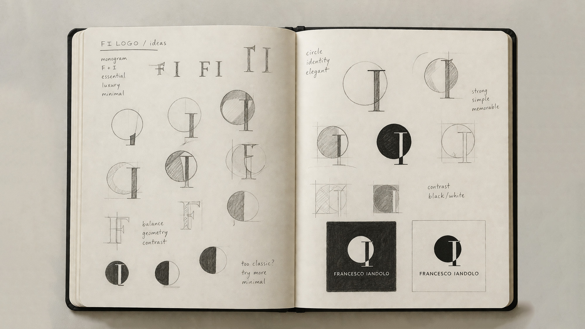
The logo carries the philosophy of the work itself. The circle is the cycle of nature, the soil that transforms and regenerates season after season. The vertical mark separates the before from the after, the moment the winemaker chooses to step in. The whole symbol is the act of capturing the identity of time. Black and white only. Built from the founder’s initials, F and I, but the meaning runs deeper than the letters.
Label and packaging system.
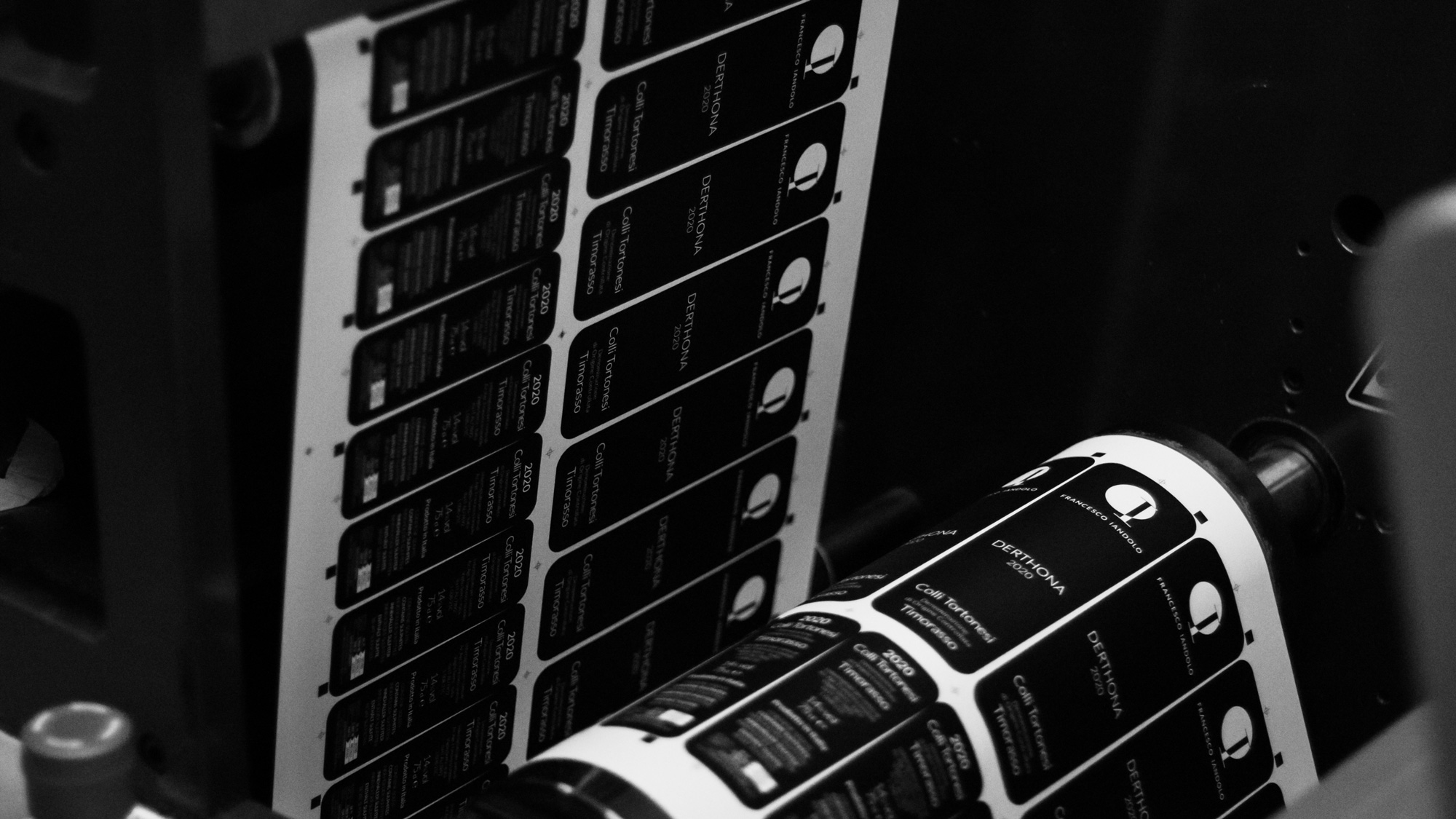
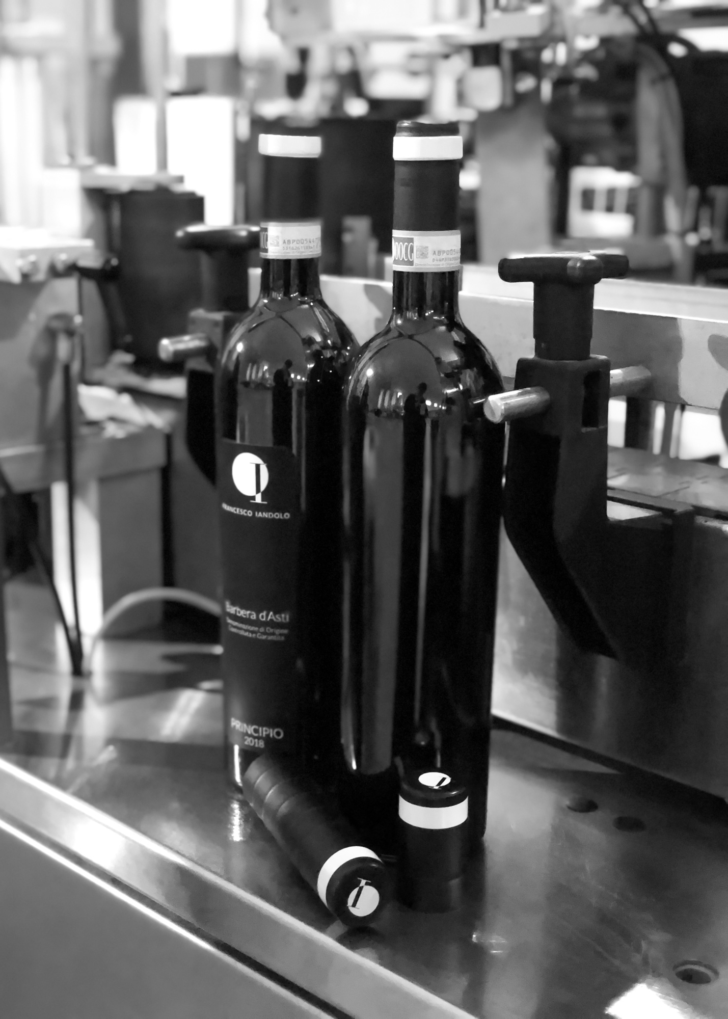
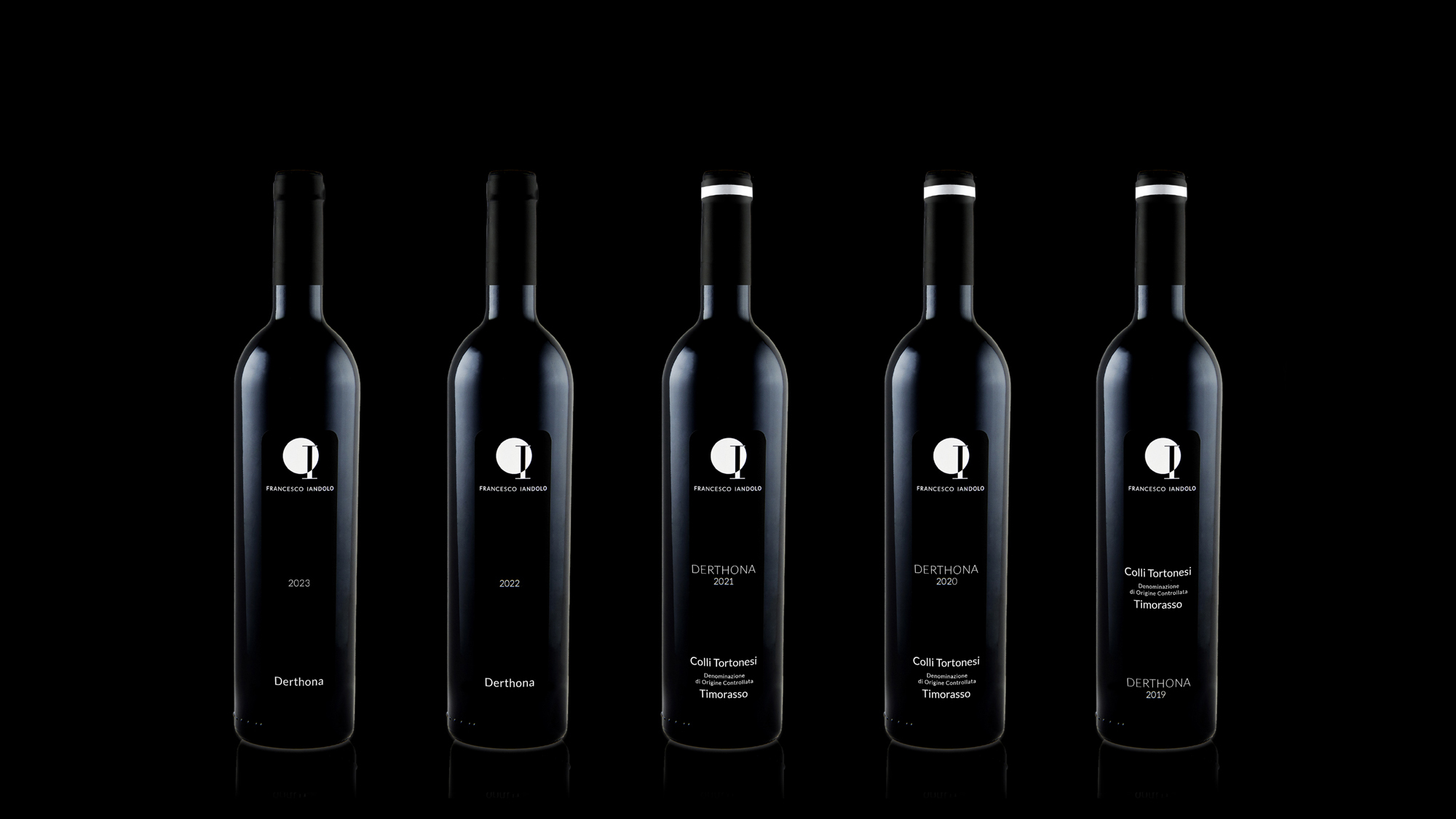
Designed for the bottle before the first bottle existed. Now applied across every vintage of Derthona DOC Timorasso, and across the years when Nizza DOCG was still in production.
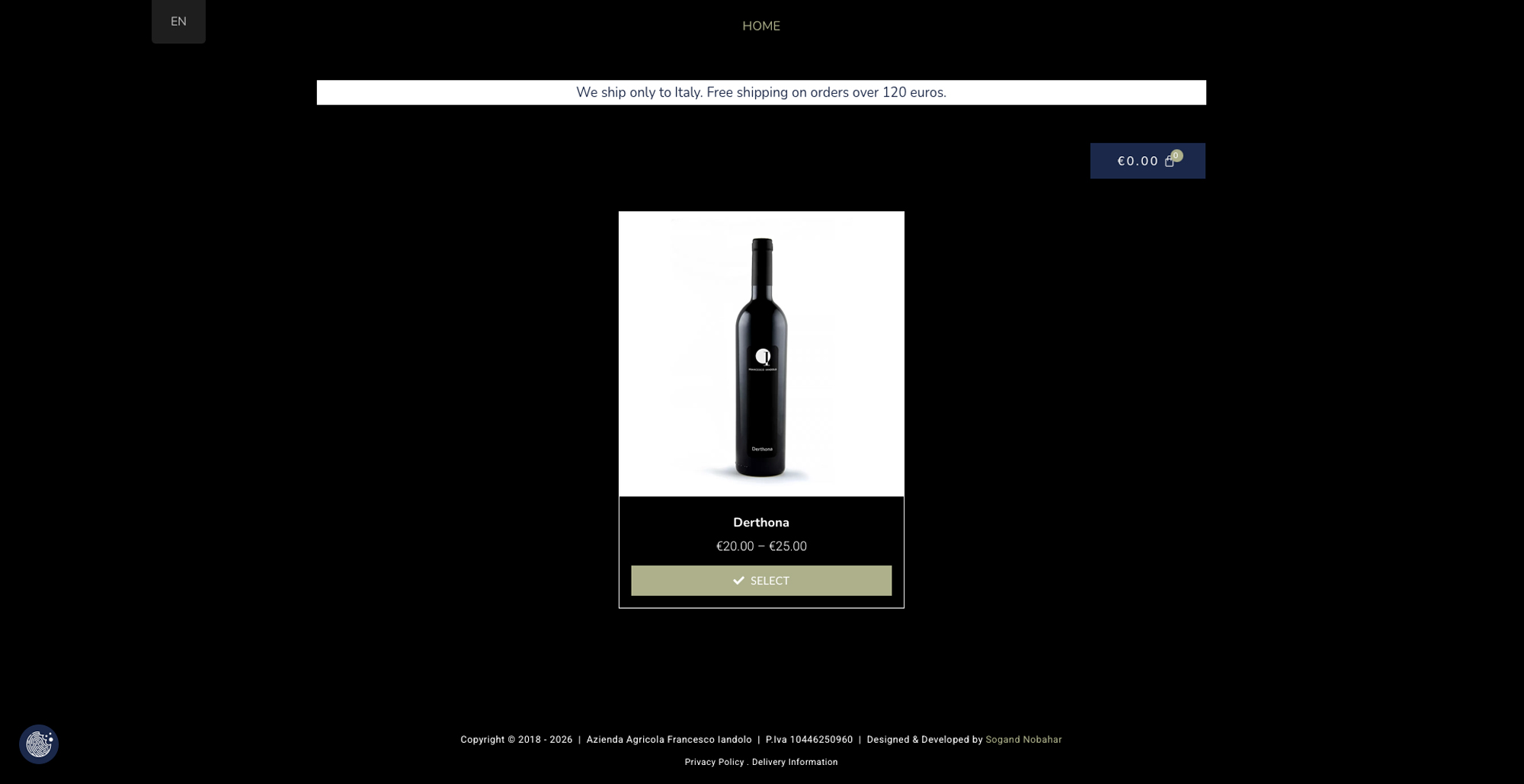
Website and e-commerce.
Bilingual. Editorial. Built to place the wine inside its territory before it ever talks about itself.
Photography and art direction.
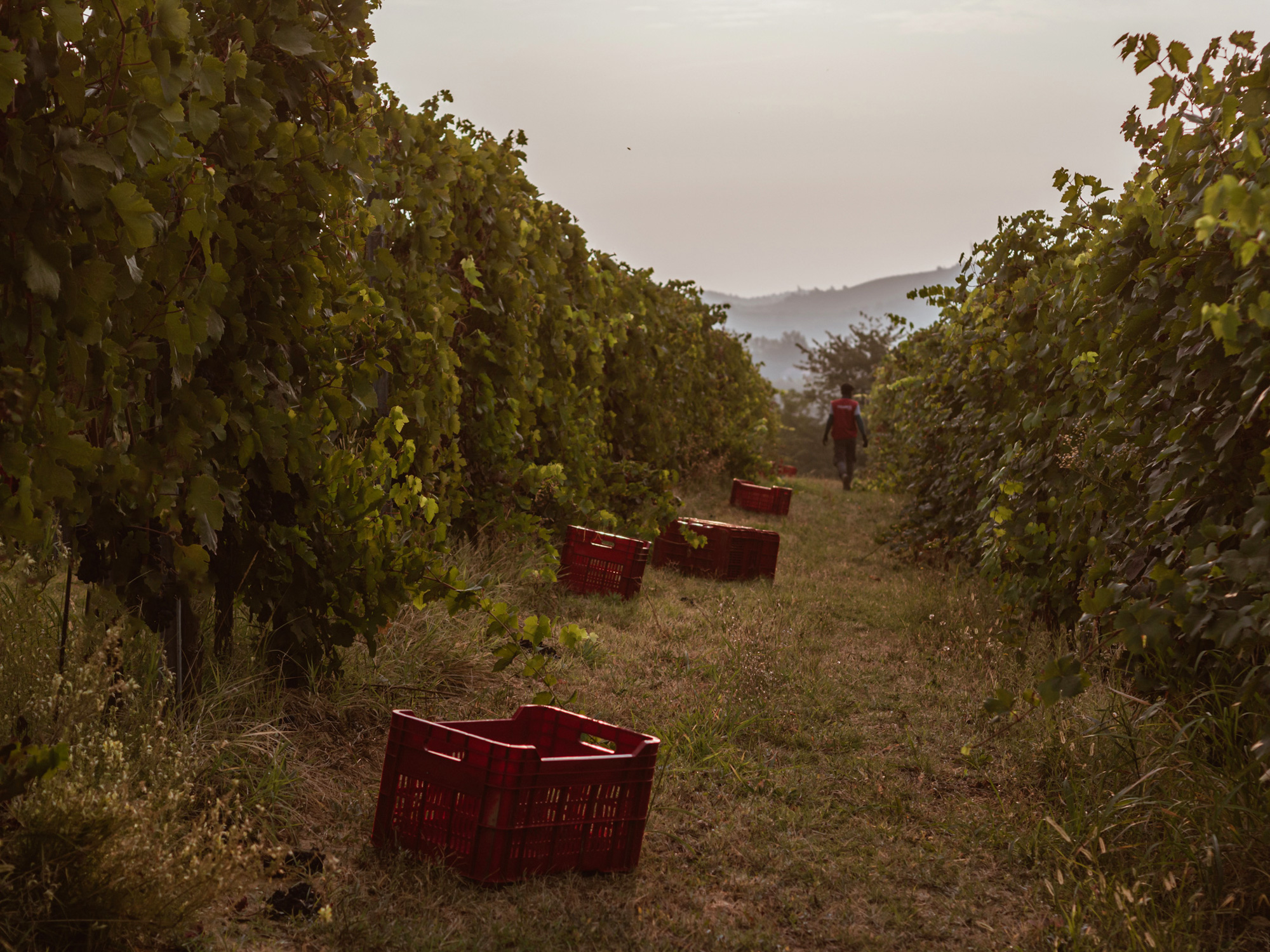
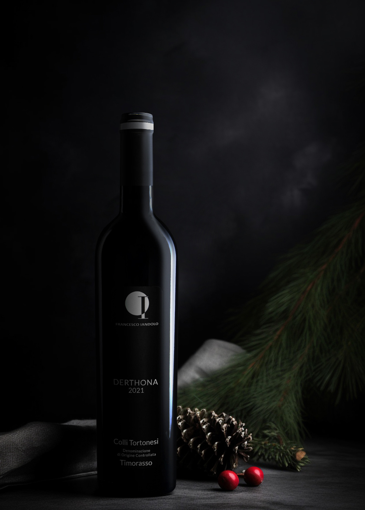
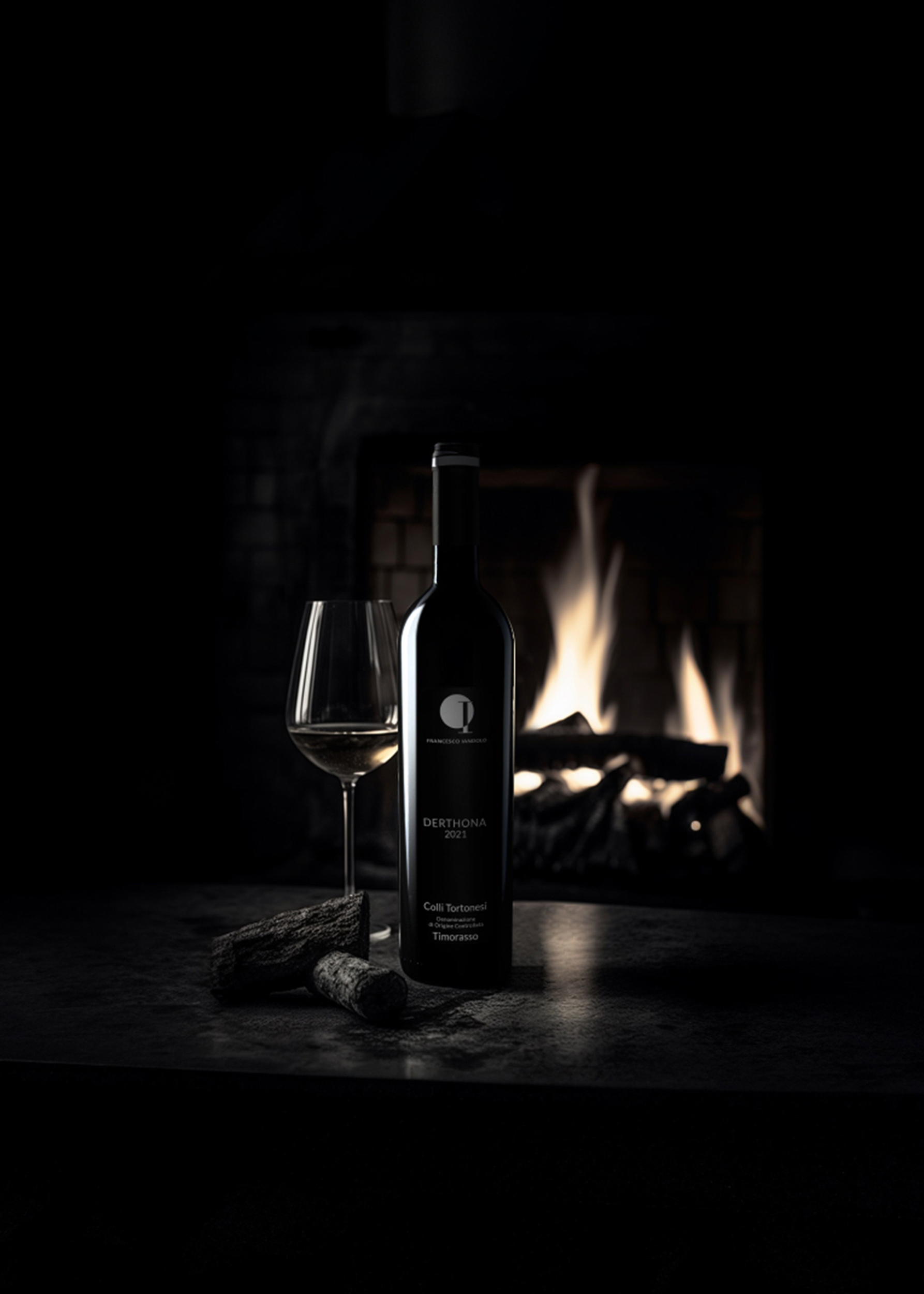
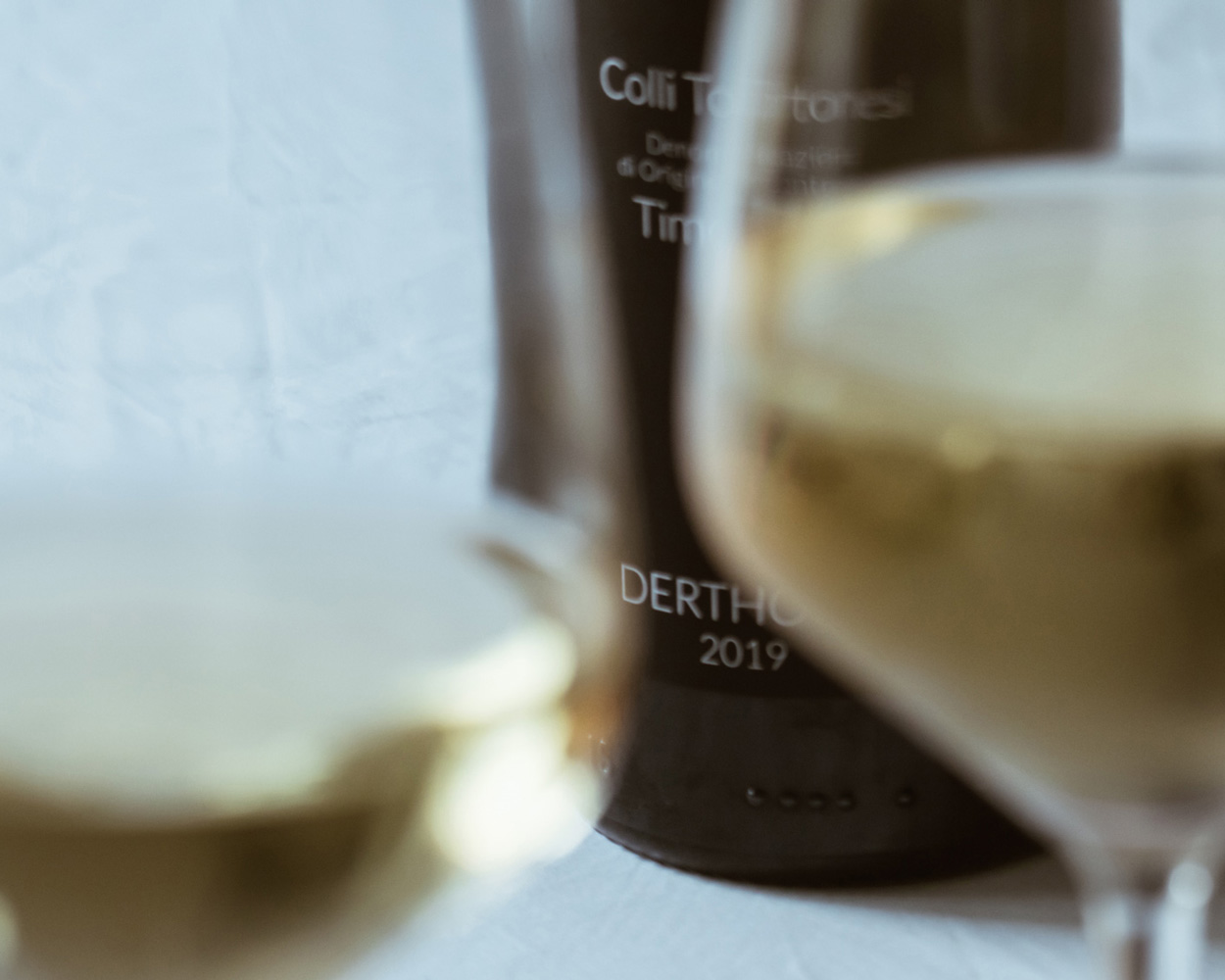
Every image you see in this case study. Every image on the brand’s website. Documentary, not staged. Built to show the wine as it is, in the place where it comes from.
What Happened
Within first years, Francesco Iandolo Winery moved from local recognition to international press.
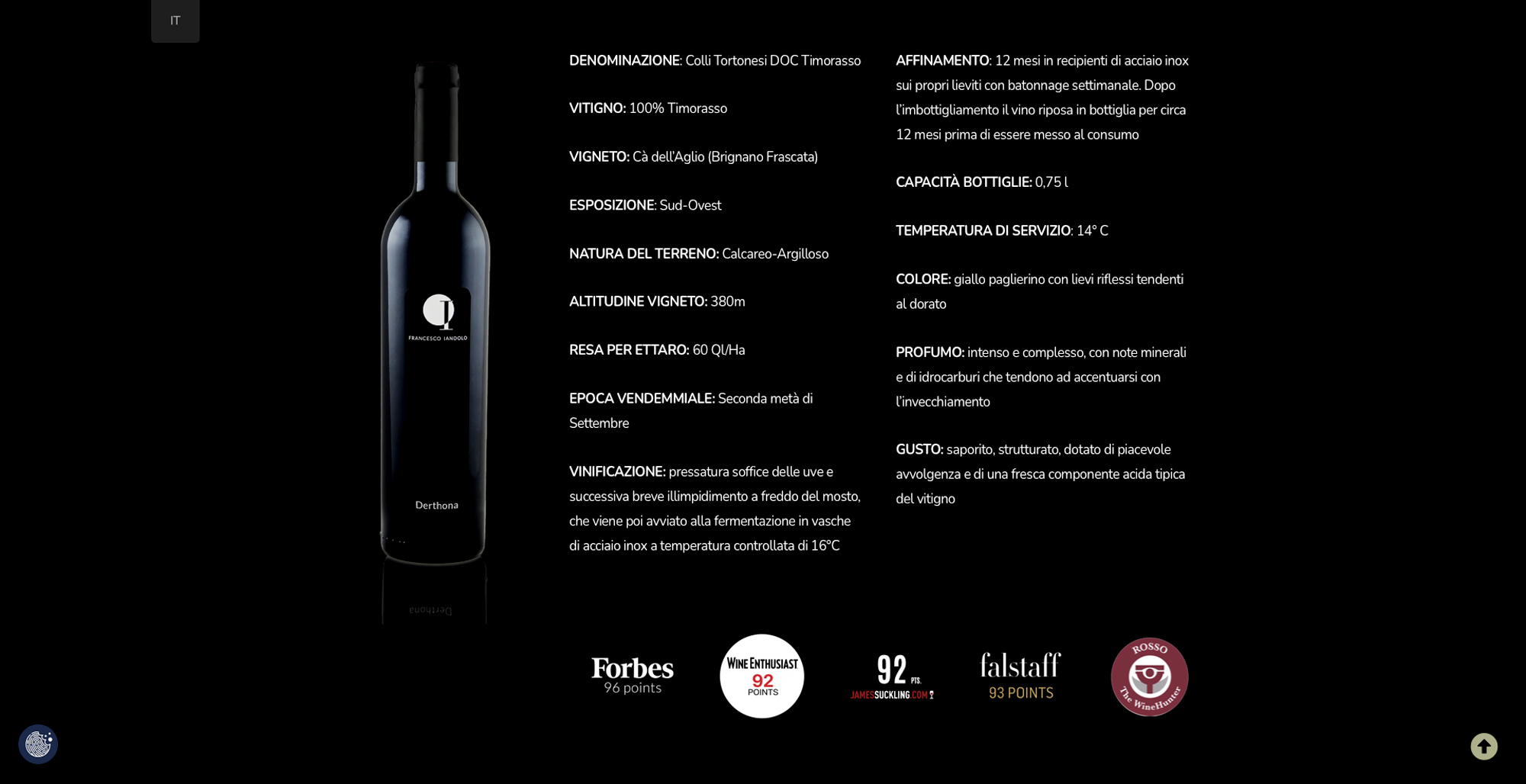
- Forbes Italia, 96 points for Derthona DOC Timorasso
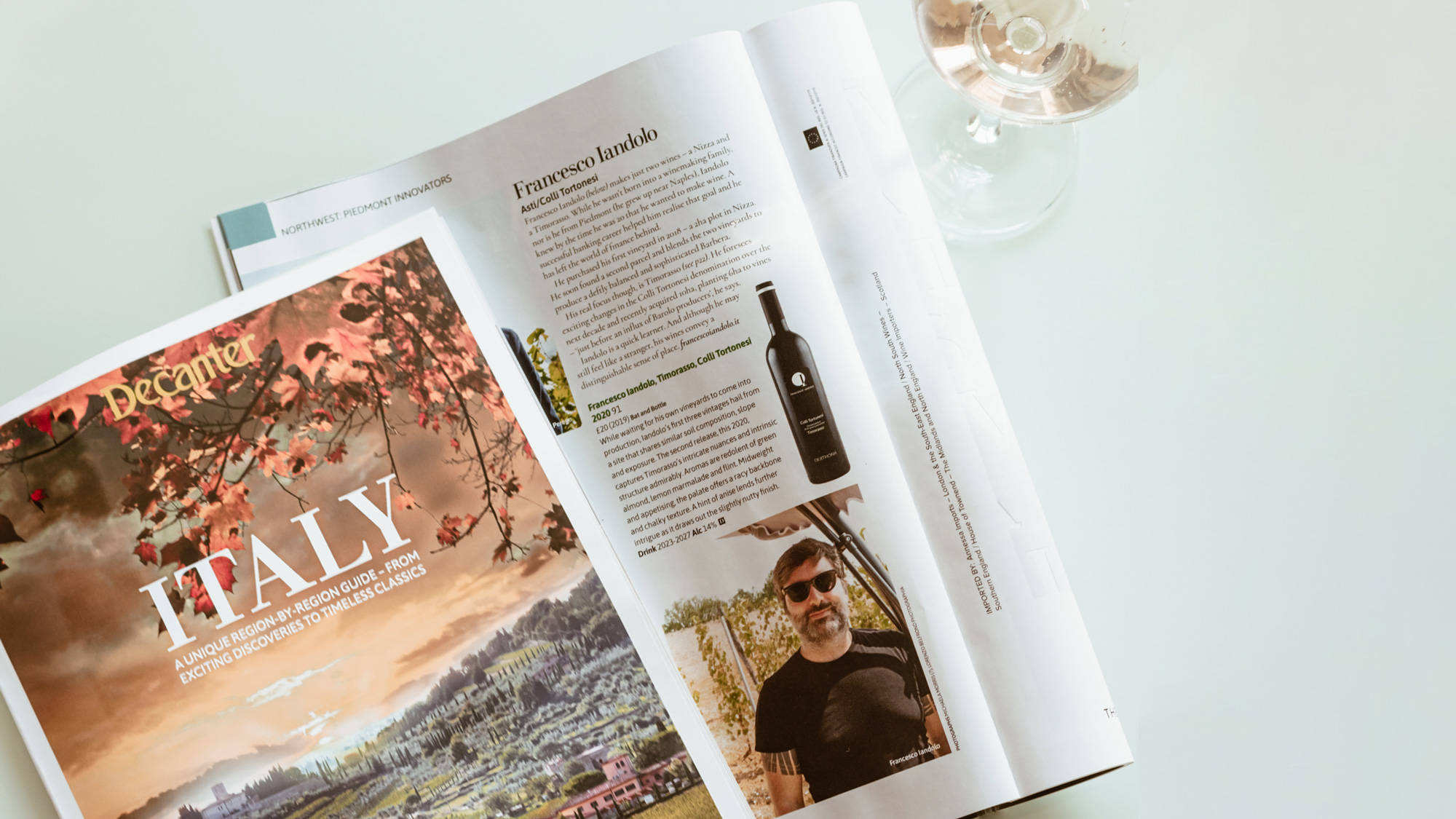
- Decanter Italy guide, Piedmont Innovators feature
- James Suckling, 92 points
- Falstaff, 93 points
- Wine Enthusiast, 92 points
- Rosso WineHunter Award
- Featured in La Repubblica and the Italian wine press
The brand is now visible in independent enotecas across Italy and exported to the UK, Germany, Switzerland, Netherland, and Australia.
Editorial photography. Same brand, different season.
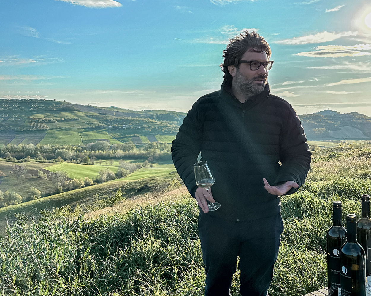
Francesco Iandolo. Colli Tortonesi, spring 2024.
The wine speaks for itself.
The brand makes sure the right people listen.
Want to talk about your brand? → Drop me a line