
Wellington Advisory M&A
Brand Narrative · Positioning · Visual Identity · Website · Valuation Tools · SEO · Content Strategy
Milano, Italia · 2026
An M&A boutique for Italian companies built on craft. The character of the three partners was the asset. None of it was visible.
The Challenge
Wellington Advisory advises the owners of Italian companies at the point where capital, ownership or succession has to become a transaction. Growth capital. A sale. An acquisition. Passing a company to the next generation.
The sectors are specific. Fashion, beauty and cosmetics, design, tourism and lifestyle, food and beverage. Companies whose value sits in a name, a workshop, a way of making something. The kind of value that does not appear cleanly on a balance sheet.
Three partners, and a distinction they drew themselves in the discovery conversations. Most advisors come from finance. They came from business. International consumer goods, fashion and luxury on one side, corporate finance and governance on the other. That combination is the reason an owner would choose them over a bank, and it was the thing the brand had to carry.
At the start it was carrying nothing. The firm was new. Everything that made it different lived in conversation, in the way the partners talked about a company when they looked at one, in the questions they asked first. None of it existed in a form an owner could meet before the first meeting.
That is the harder kind of brand problem. Not correcting something, but building the first impression of a firm whose proof arrives later. Deal announcements come after closing, and only with permission. Until then the brand is the only evidence there is.
So the brief had two halves. Make the firm look like the world it serves rather than the world it operates in. Then give it a way to demonstrate judgment while the track record is still being built.
I asked them the same question I ask at the start of every project. What should an owner feel about you before they know anything about you?

“Every M&A firm in Milan is navy. Wellington’s clients are in leather, marble, wine, hillsides. The identity had to come from their world, not from finance.”


What I Built
I started with the narrative. Nothing visual gets decided before the positioning is written down and agreed.
Brand narrative and positioning.
Nineteen pages, written after a partner discovery questionnaire. Brand story, positioning, differentiation, tone of voice, messaging by audience, language rules.
The positioning that came out of it: a strategic advisor first and a transaction executor second. The partners named the two qualities they wanted the firm to stand for, calm leadership and strategy, and every later decision was tested against those two words.
The language section included a list of phrases the brand would not use. End-to-end solutions. Best in class. Seamless process. Value creation with no concrete context. A firm that wants to avoid financial nonsense has to be shown, in writing, what nonsense looks like.
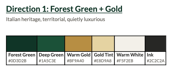
The colour.
Forest Green #0D3D2B and Warm Gold #BF9A40 on Warm White #F5F2EB.
Navy is the default in this sector, which is the argument against it. Navy reads institutional and cold, and it says the firm belongs to finance. Wellington’s clients belong to territory, craft and family continuity.
Forest green is equally credible and carries something navy does not. Groundedness. The hills, the north, the colour of things that last. Serious without being cold.
The gold is matte and warm, not the gold of banking. It references manufacture and the careful work of makers, and it appears only as punctuation. A rule, a divider, one accent. Never a field.
Warm white as the ground, because it reads as paper rather than screen.
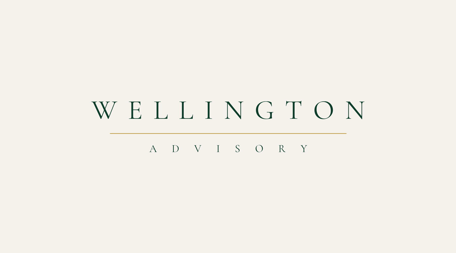
The logo.
Two directions, and both survived, which was deliberate.
The primary mark is the name alone. Wide-tracked capitals, a hairline gold rule between the two words, ADVISORY in ultra-light spaced capitals beneath. No symbol. The rule is structural rather than decorative, separating the firm’s identity from its function.
The secondary mark is the horizon star. Two curved hill contours layered into depth, an Italian landscape reduced to two lines, one gold point above them. The point is calm direction, the star you navigate by.
The wordmark takes the site, print and signage. The horizon star takes the favicon, the app icon, the footer and the closing mark on every document. The name holds the authority. The mark holds the land.
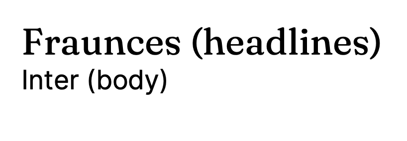
Typography.
Three faces, one job each. Fraunces for headlines, where the firm needs weight. Inter for body, where it needs to be read at small sizes on a phone. Cormorant Garamond for the wordmark only, never anywhere else.
Tracking does the work that weight would do in a louder brand.
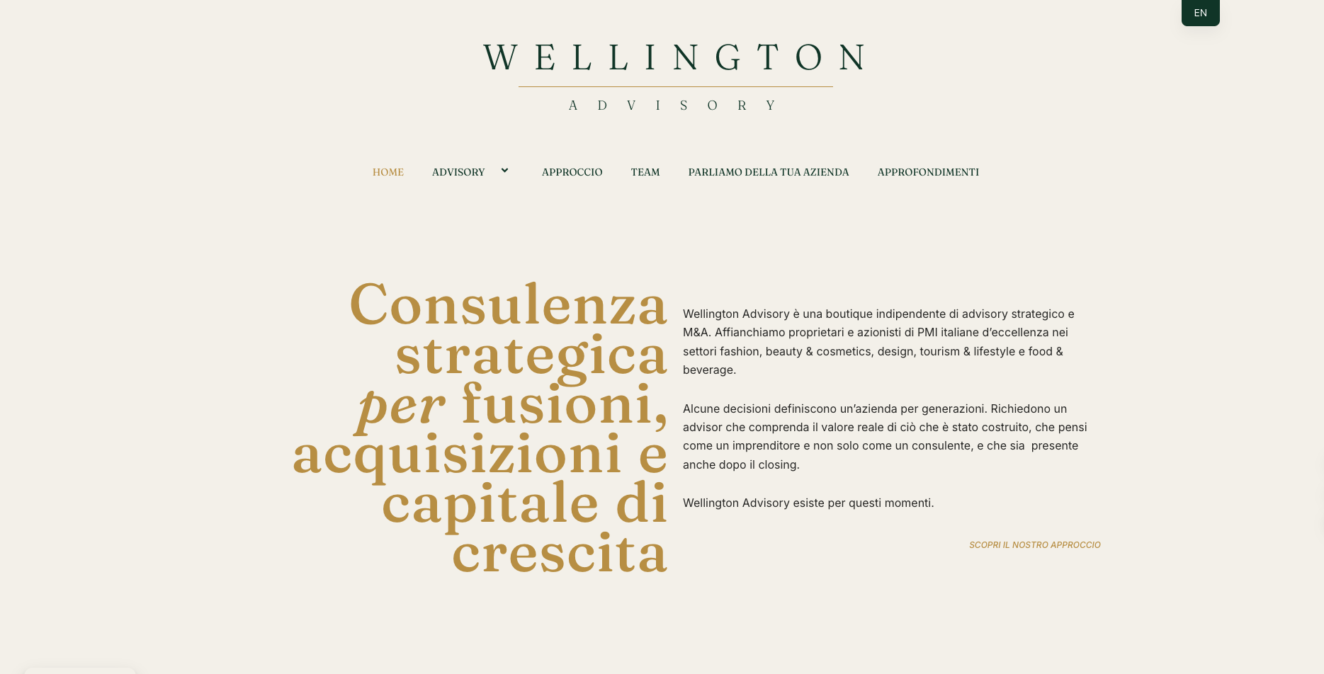
Website, bilingual.
welladvisory.it, Italian and English throughout. Home, Advisory with sell-side and buy-side, Approccio, Team, Parliamo della tua azienda, Approfondimenti.
The homepage opens with the offer in gold display type and the reason for the firm in plain body text beside it. No hero image, no stock photography, no carousel. The typography carries it.
Sell-side and buy-side are separated because the two readers want opposite things. An owner thinking about selling and a group looking to buy should not land on the same page and read the same paragraph.
Two valuation tools.
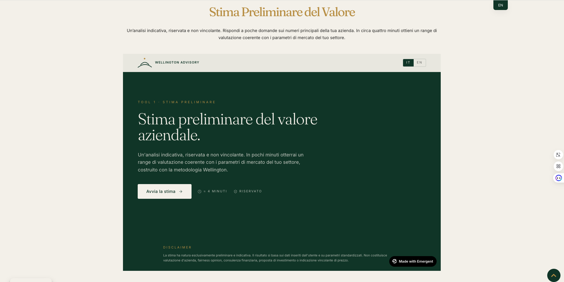
Stima del Valore. Around four minutes, confidential, indicative, non-binding. A few questions on the main numbers, and a valuation range consistent with the sector’s market parameters.
Simulazione dell’Operazione. For someone who already has a number. Share sold, capital raised, value retained over time.
The partners had the working logic. I directed both into the identity and built them out on Emergent.
This is the part of the project that is not decoration. An owner considering a sale rarely calls a banker first, because the call is itself a disclosure. Say it out loud and the process starts moving before they are ready. The tools give them a way to get a number in private, on their own, in four minutes, and to keep thinking. The brand becomes a reason to make contact instead of an argument for making contact.
Sector imagery.
Images inspired by core sector and identity of the brand.
For instance, marble and brass for design. Leather for fashion. A glass on burnt wood for food and beverage. Water and a boat deck for tourism and lifestyle.
No boardrooms. No handshakes. No skyline of Milan. Material, light and surface, held close enough that scale disappears. The firm advises companies whose value is in how something is made, so the imagery is about making rather than about dealing.
Generated and prompt-directed, then selected and colour-matched into the palette. One brand colour behaving as light and shadow across every frame.




Search and answer engines.
Italian first. The audience is Italian owners, so the primary language is Italian and English exists for the international investor side, not the other way round.
Page structure, titles and descriptions written for the questions an owner actually types, which are about their own situation rather than about M&A as a category. Image files named for the firm, the sector and the audience rather than left as camera output. Sector and service pages built as distinct entities so an answer engine can tell what the firm does, for whom, and where.
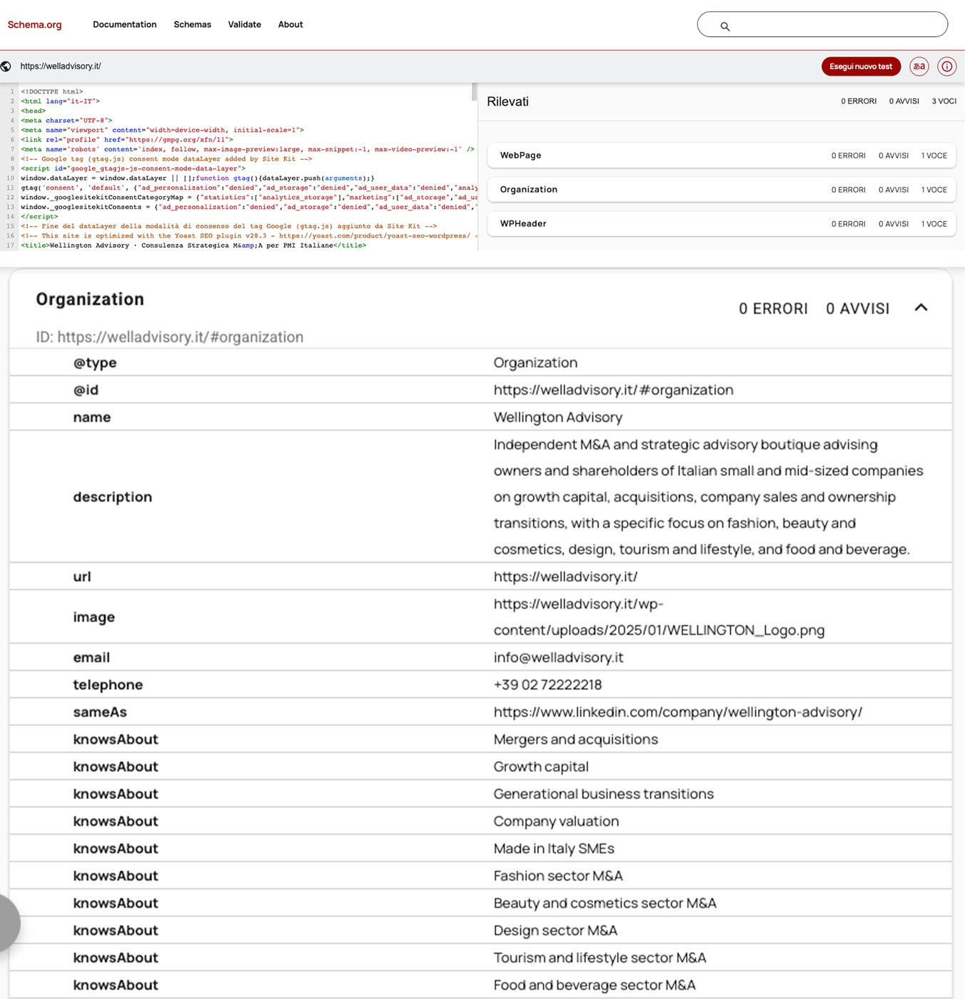
Then the layer most sites skip. Structured data, written by hand, that tells a machine what Wellington is before it reads a word of the site. The firm as a single entity, its address, its five sectors, its three founders each linked to a real profile, one identifier reused across every page so the whole site resolves to one company rather than to several versions of a name.
The reason to bother is that people no longer only search. They ask. An owner typing a question into an answer engine gets one paragraph and two or three sources, and a firm that has not told the machine who it is does not appear in that paragraph.
Print and stationery.
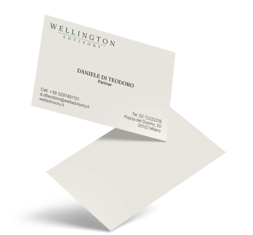
One-page profile and a longer firm profile in English, business cards, letterhead. Warm white stock, green wordmark, the horizon star closing every document.
Editorial programme.
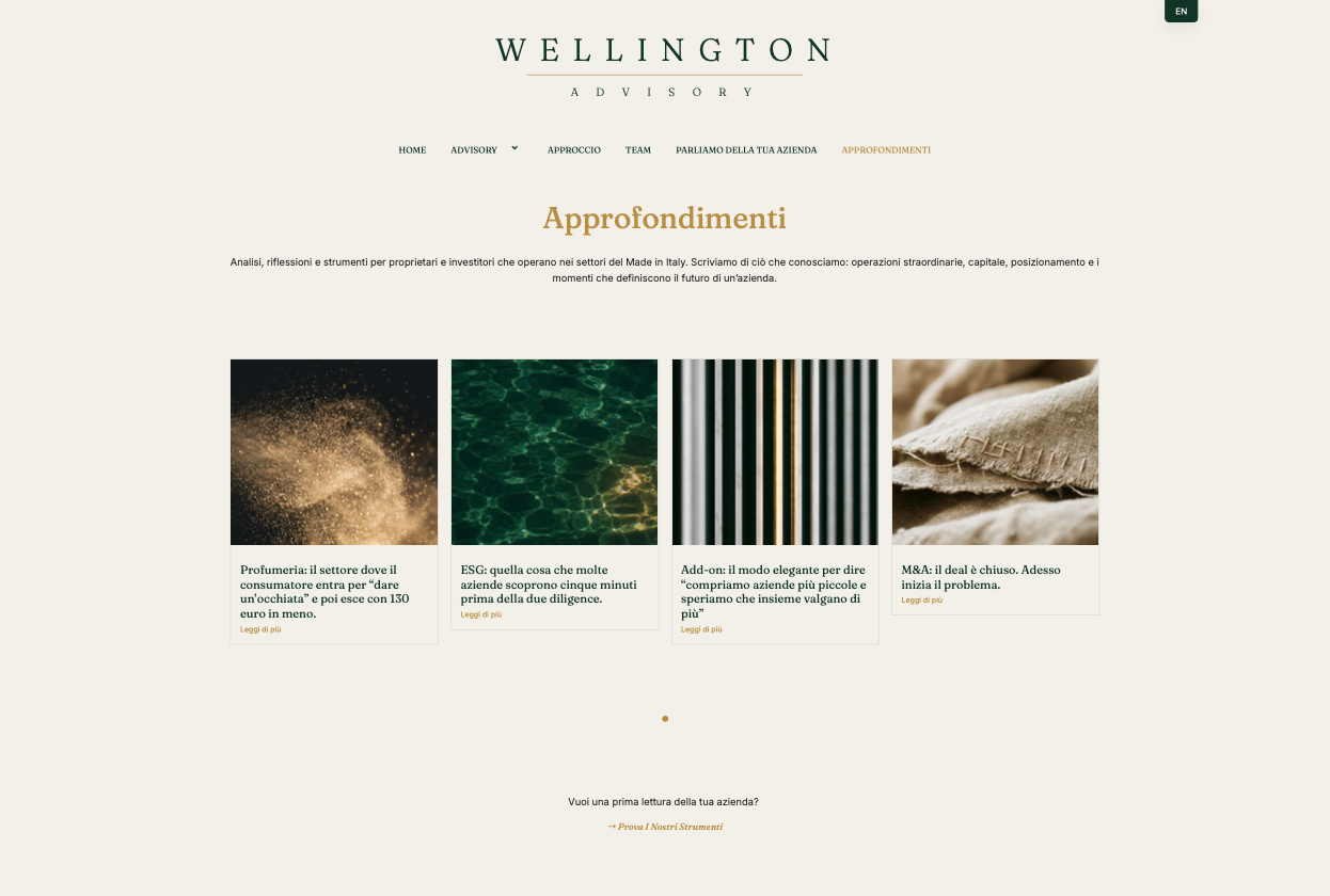
The site publishes under Approfondimenti, in the brand voice rather than in press-release Italian. One title reads M&A: il deal è chiuso. Adesso inizia il problema. Another describes add-on acquisitions as the elegant way of saying you are buying smaller companies and hoping they add up to more together.
That register is the whole strategy. An advisory firm that says the awkward part out loud reads as an advisor. One that only says the reassuring part reads as a vendor.
Where It Stands
The brand went live in Italian and English in 2026.
It now carries everything. The site, the editorial programme, both valuation tools, print and stationery. The firm publishes in its own voice, and an owner arriving from a search meets the same brand in every place they land.
The rest is being written. Deal announcements come after closing, and with permission.
Wellington and the winery are the same method in opposite sectors. Understand what was actually built. Then take away everything that is not it.
Want to talk about your brand? → Drop me a line