Sogand Nobahar

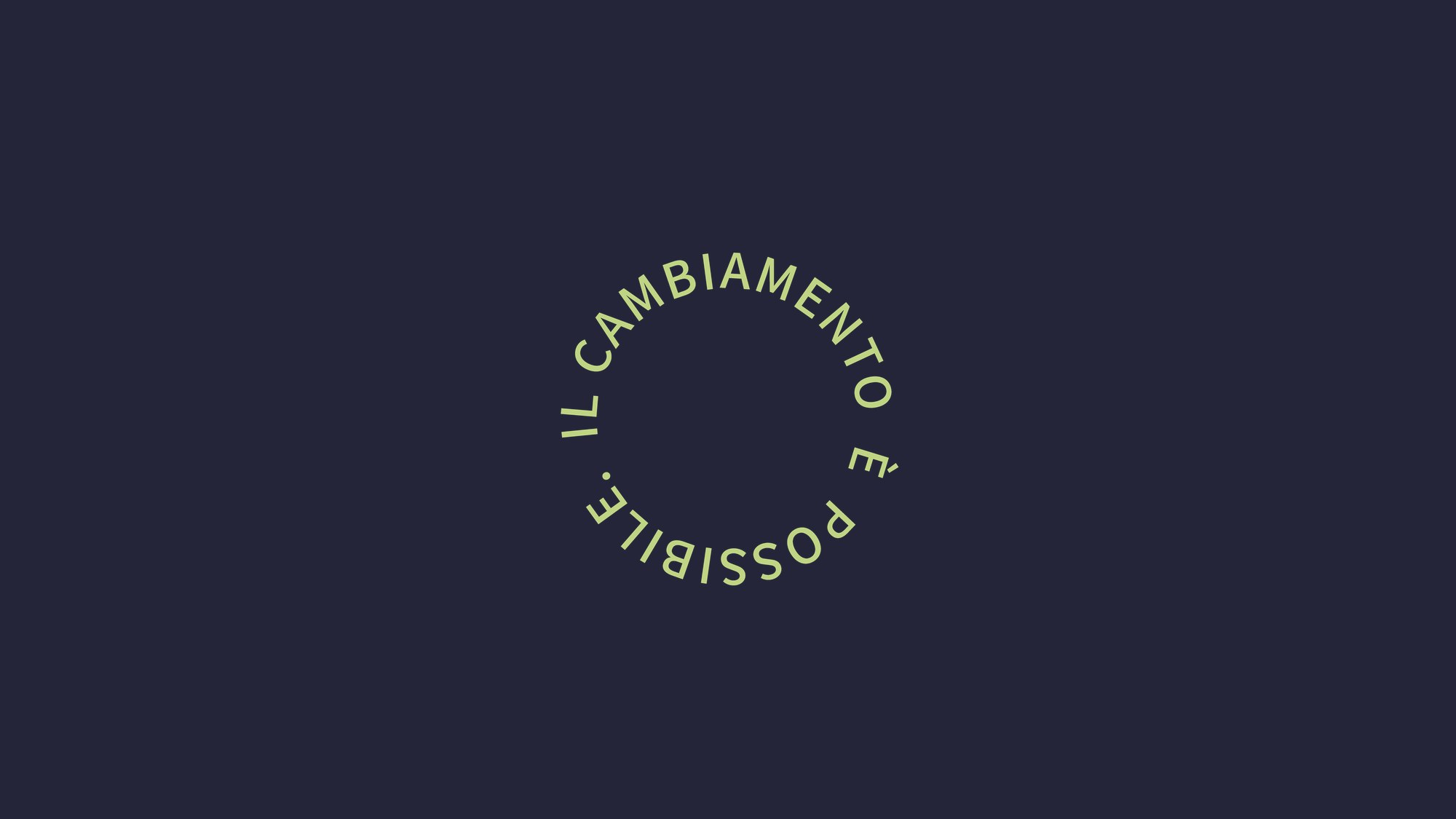
Il cambiamento è possibile seal in light green on navy, brand mark for Coltivazione Elementare designed by Sogand Nobahar

COLTIVAZIONE ELEMENTARE

Visual Identity · Guideline Book · Website · Member System · Social Templates · Newsletter

Italy · 2021

A method built on doing less had a brand built on doing more.

Gian Carlo Cappello has been an agrotecnico since 1977. Fifty years in the field brought him to a practice he calls Coltivazione Elementare, known also as the Non-metodo Cappello. No tilling, not even at the start. No fertiliser, chemical or organic. No irrigation systems. No compost, no crop rotation, no cover crops, no planning of space. Hay on the ground, a seed underneath it, and the rest left alone.

The method is a list of things he does not do.

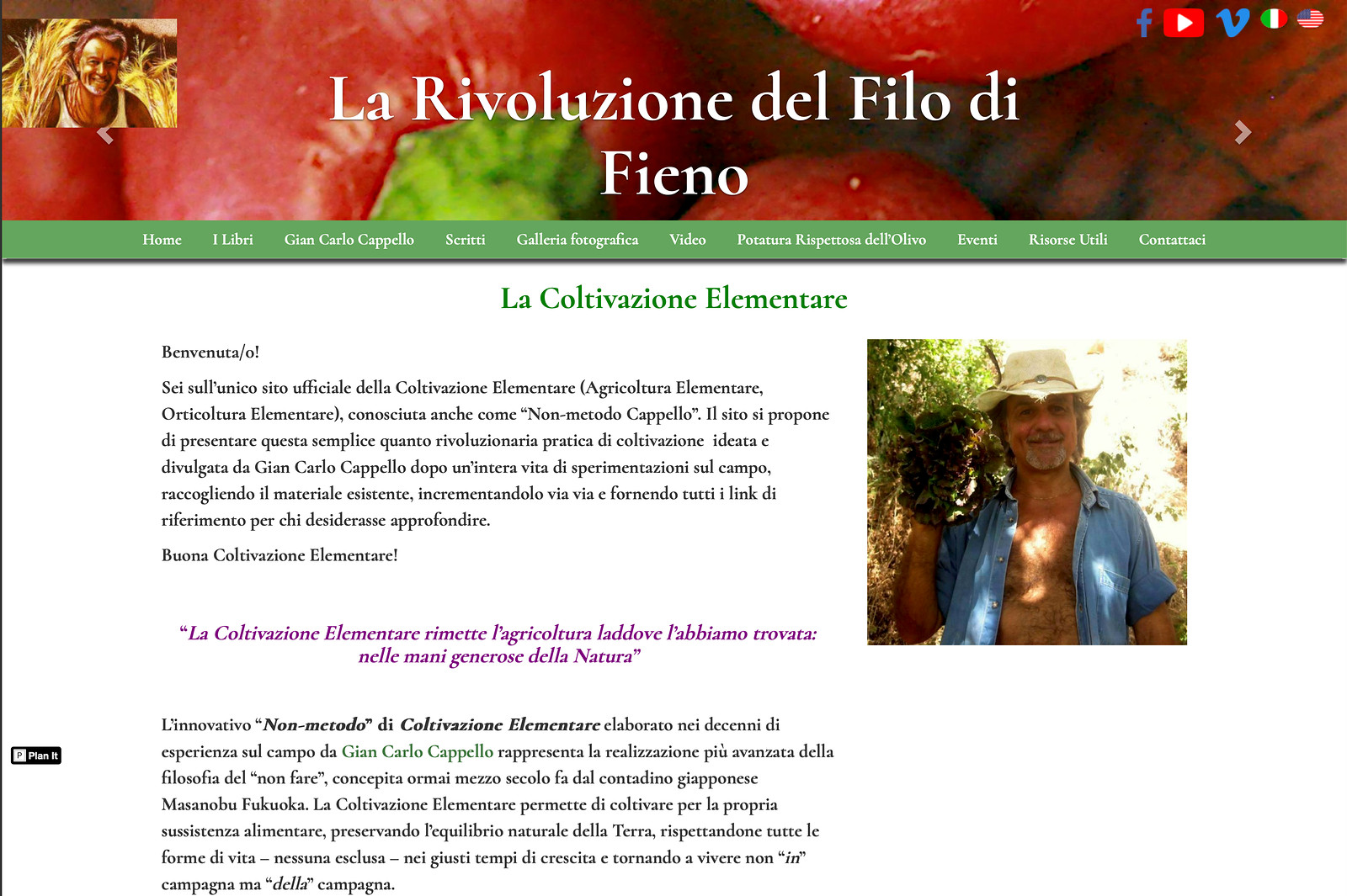
The site carrying it was the opposite. One column. Sixty-odd reader testimonials stacked end to end, every one at the same weight, the book cover at the top and nothing after it to hold onto. A person arriving for the first time had no way in and no reason to stop reading at any particular point.

The contradiction was not cosmetic. A practice built on subtraction was being communicated through accumulation. That was the thing to fix, before any question of colour or type.

Previous Coltivazione Elementare website, single column of stacked reader reviews, before the 2021 redesign 2
Previous Coltivazione Elementare website, single column of stacked reader reviews, before the 2021 redesign 1

Previous Coltivazione Elementare website, single column of stacked reader reviews, before the 2021 redesign

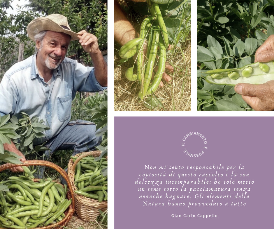
“He already had the sentence. It closed every talk he gave. My job was to give it a shape that could travel.”

Quote card from Gian Carlo Cappello on a violet field with the Coltivazione Elementare seal, template by Sogand Nobahar

The positioning

The archetypes came from his own answers. I sent a brand questionnaire, read the responses against the twelve Jungian archetypes, and narrowed to four that fit. Then two pairings, seventy and thirty, with the reasoning for each. Explorer with Magician, or Creator with Hero. He chose Creator with Hero.

Hero needed handling. His practice refuses the fight. No war on weeds, no war on disease, no enemy anywhere in the garden. Read as combat, Hero would have contradicted the method it was meant to carry.

But the questionnaire had not pointed at a fighter. It pointed at a man who wanted to say, without hedging, that a century of agronomy took a wrong turn. That is what Hero gave him. Conviction, not conflict. Thirty percent, confined to voice. Creator carried the rest, because the method is an act of imagination before it is a technique.

The mood held to three words through every deliverable. Wise. Pure. Heroic.

The colours

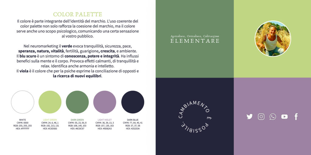
Light green and dark green for the ground. Dark navy for the sky and for weight. White for air.

Violet for the part of the method that is not agricultural at all. Cappello writes as much about interior change as about hay. He asks people to sharpen intuition, to trust an innate competence, to grow personally alongside the garden. Violet is where that lives on the page, and it is the only colour in the set that is not literal.

The seal

Il cambiamento è possibile. Change is possible.

He was already saying it. It closes the brochure, it opens the site, it ends his talks. I did not write a tagline. I found the sentence he already used and built a container for it.

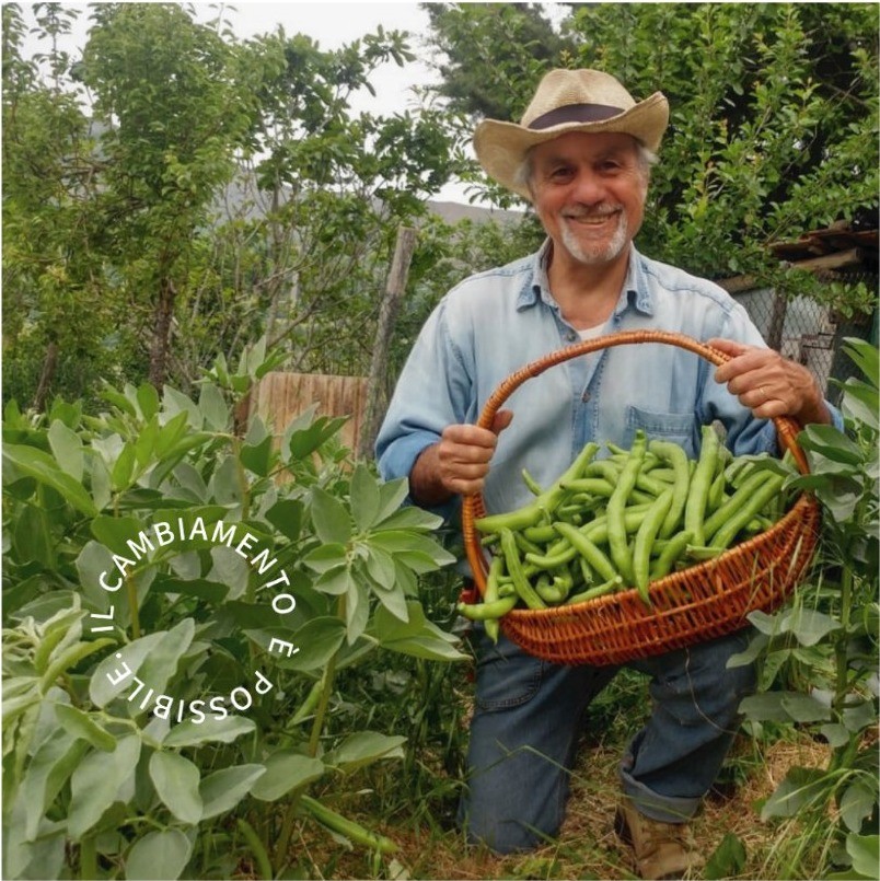
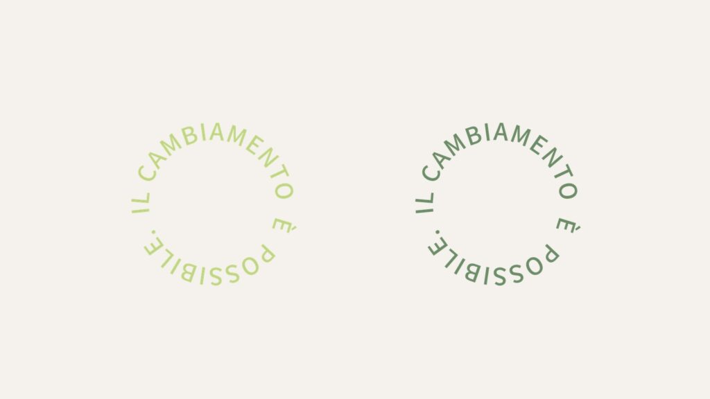
I set it in a ring. A closed circle, no beginning and no end, which is how a season behaves and how the method describes itself. It became the mark that does the work the logotype cannot do. Profile picture. Watermark across his own photographs. A single tile in a feed, colour and nothing else. Small enough for a business card, large enough to fill a wall.

The logotype names the thing. The seal says what it is for.
Coltivazione Elementare seal applied over a photograph of a grower harvesting, by Sogand Nobahar
Coltivazione Elementare seal shown in light green and dark green, brand mark by Sogand Nobahar

 The logotype

Agricoltura, Orticoltura, Coltivazione in italic above. ELEMENTARE in wide capitals below. Three words for what people actually search, one word for what it is.

The letterforms are drawn rather than engineered. Open, slightly irregular, with the weight shifting inside the strokes. The mark had to carry hand work, because hand work is the entire proposition.

Anaktoria for titles. Assistant for body copy, bold as the primary weight, letter-spacing set at twenty-five on web so the text keeps the same air the logotype has.

Coltivazione Elementare primary logotype in dark green, drawn letterforms by Sogand Nobahar
Coltivazione Elementare logotype in grey used as a photographic watermark, designed by Sogand Nobahar

 The guideline book

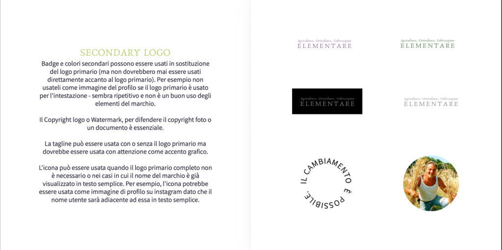
Twenty-two pages. Minimum reproduction sizes, fifty millimetres for the full logotype and ten for the icon. Clearspace defined as the height of two capital T from ELEMENTARE, so it scales proportionally without anyone needing to measure. Rules for placing the mark over photographs. The palette in CMYK, RGB and HEX.

The book exists because the brand would be applied by people I would never meet. Associations, ecovillages, course organisers, volunteers. A brand that spreads through other people’s hands needs written law, not taste.

Brand guideline book spread showing clearspace and minimum logo sizes for Coltivazione Elementare, by Sogand Nobahar
Brand guideline book colour palette page with CMYK, RGB and HEX values for Coltivazione Elementare

The website

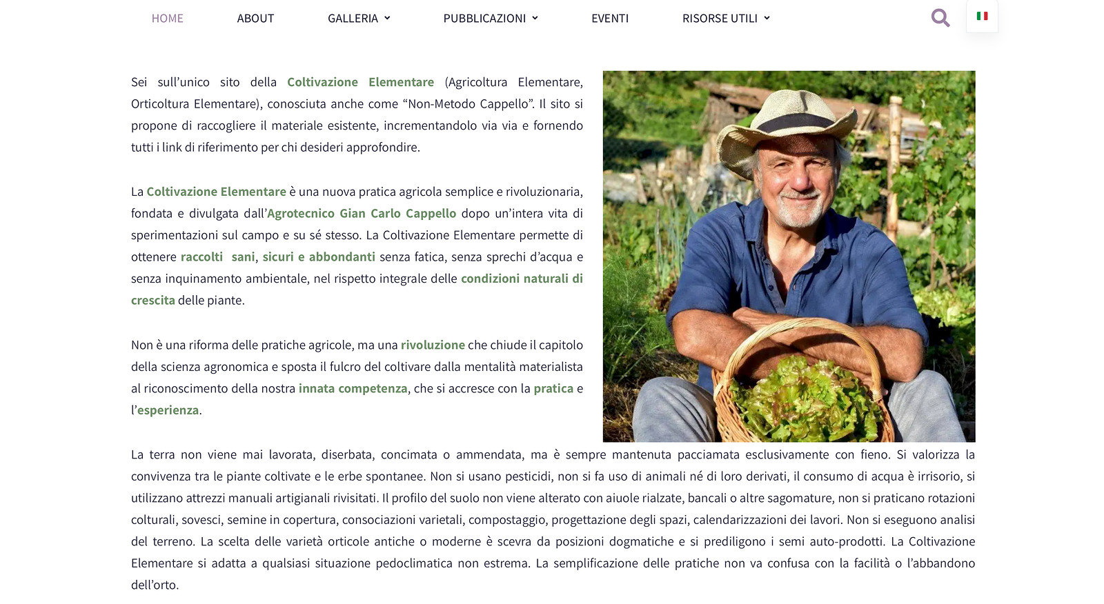
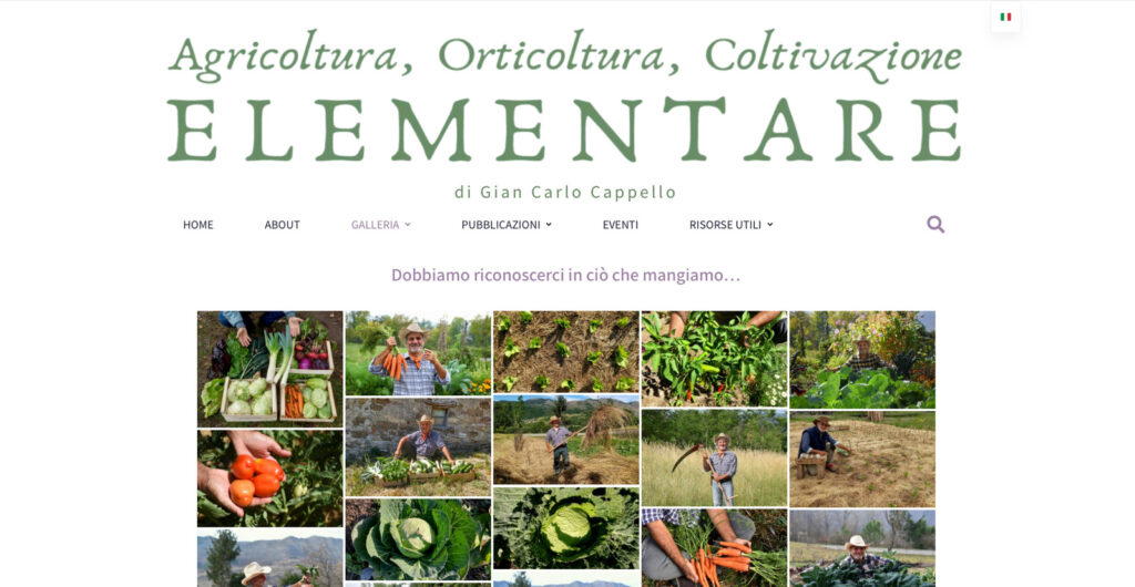
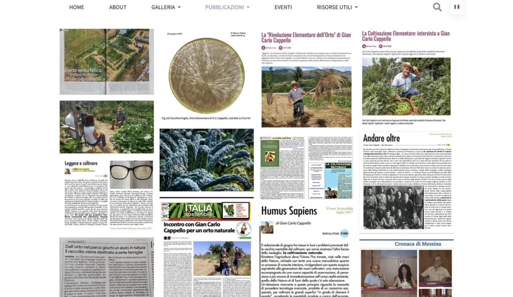
Home, About, Galleria, Pubblicazioni, Eventi, Risorse Utili. Built in WordPress so it could be maintained without a developer on retainer.

The Galleria carries the argument photographically. Same beds across different months, hands in every second frame, and no bare soil anywhere in the set. A reader who scrolls it understands the method before reading a word about it.

The Pubblicazioni page gathers the press into one place. It had never existed as a single view.

Coltivazione Elementare website homepage content, WordPress site designed
Coltivazione Elementare website photographic gallery of the vegetable garden across seasons, web design by Sogand Nobahar
Coltivazione Elementare website press page, designed and built by Sogand Nobahar

The gate

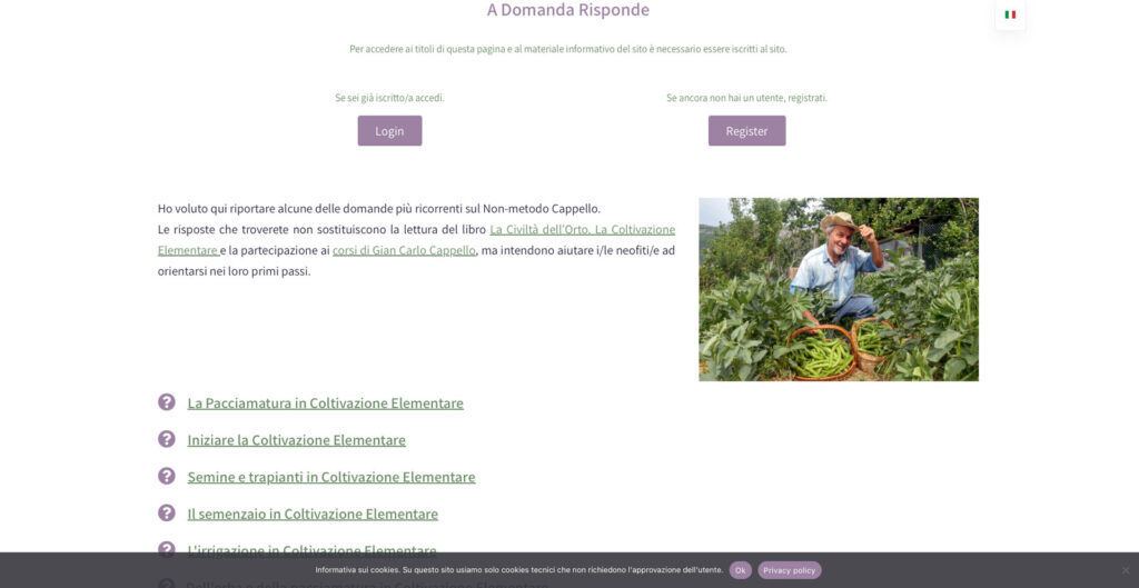
A Domanda Risponde sits behind registration. The recurring questions about mulching, sowing, seedbeds, irrigation, answered in his words, readable only by members.

This was the hardest decision on the project. Cappello argues for food self-sufficiency and the overcoming of the capitalist economy. Putting his answers behind a login could easily have read as the opposite of everything he says.

It works because the gate is free and the currency is contact rather than money. Registration builds the list. The list carries the course dates. The courses are where the method actually transfers, in a field, in person, over two days. The site is not selling the knowledge. It is routing people to the place where the knowledge is given away.

Member registration and login page for the A Domanda Risponde section of the Coltivazione Elementare website

The system they could run by themselves

Whatever I built had to work in their hands, with their own field photographs, on a phone if it came to that.

So the templates were built in Canva. Not the tool I would choose for myself, and that is exactly the reason. A locked design file would have looked better and died the first time I stopped answering emails.

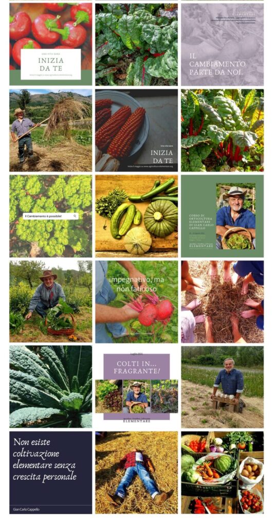
Nine template types. Photograph with the seal as watermark. Quote card on a flat colour field, his words, his name beneath. Event announcement, portrait right, details left. Three-image newsletter header. Solid tile carrying the seal alone, used as punctuation so that a feed of green fields does not collapse into one green field.

The newsletter went onto Flodesk, on the same system, and handed the sending across. They have run it themselves since.

Instagram grid showing nine social template types for Coltivazione Elementare, content system by Sogand Nobahar
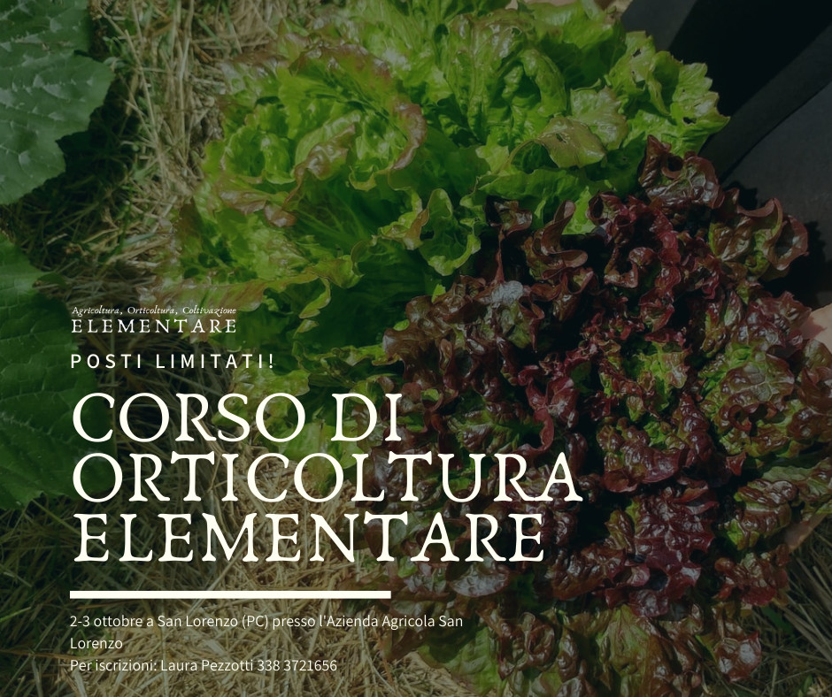
Course announcement card for a Gian Carlo Cappello orticoltura course, event template by Sogand Nobahar

Courses went out on the identity and filled through the site. Maggia in Ticino with the Associazione Permacultura Svizzera Italiana. San Lorenzo in the province of Piacenza with the Azienda Agricola San Lorenzo. Two countries in one season, organised by people neither of us employed, all of it recognisably one brand.

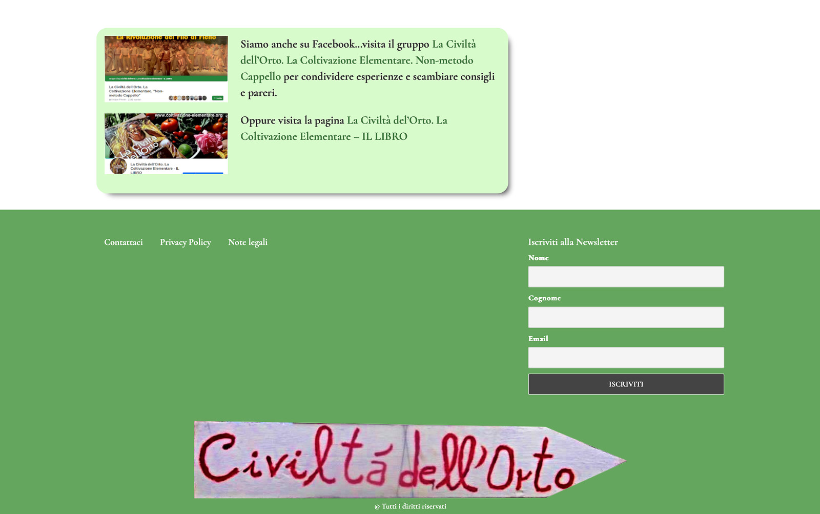
The Pubblicazioni page now holds interviews, magazine features and television coverage in a single view. Some of that coverage predates the identity. Identity delivered June 2021. Site live later that year.

I designed and built the site and stayed on it for almost two years after launch. Maintenance, debugging, backups, and the newsletter whenever something needed fixing. Then it moved to other hands. What is live today is no longer mine to answer for.

He spent fifty years taking things out of agriculture.

The brand had to be made the same way. One sentence. One circle. Five colours, two typefaces, a book of rules thin enough to follow, and a system simple enough that he could run it without me.

Want to talk about your brand? → Drop me a line