NOBAHAR DESIGN
Brand Creation · Contemporary Jewelry · Decorative Objects · 3D Wall Art · Photography . E-commerce . Exhibition Strategy
Milan → Piemonte, Italy · 2017 → ongoing
I built this brand from zero. No funding. No team. No shortcuts. 50+ international exhibitions. Florence Biennale. Vogue Talent.
The Story
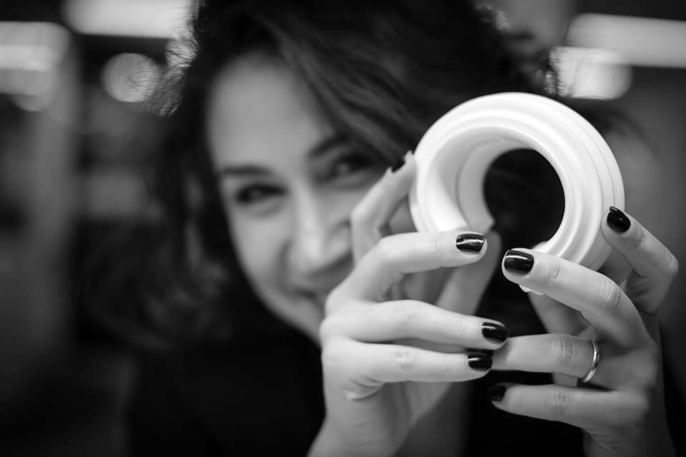
Nobahar Design is my own brand. Contemporary jewelry and decorative objects, made since 2017. It is here because it is the clearest proof of what I know: what it takes to build something from nothing, and keep it alive.
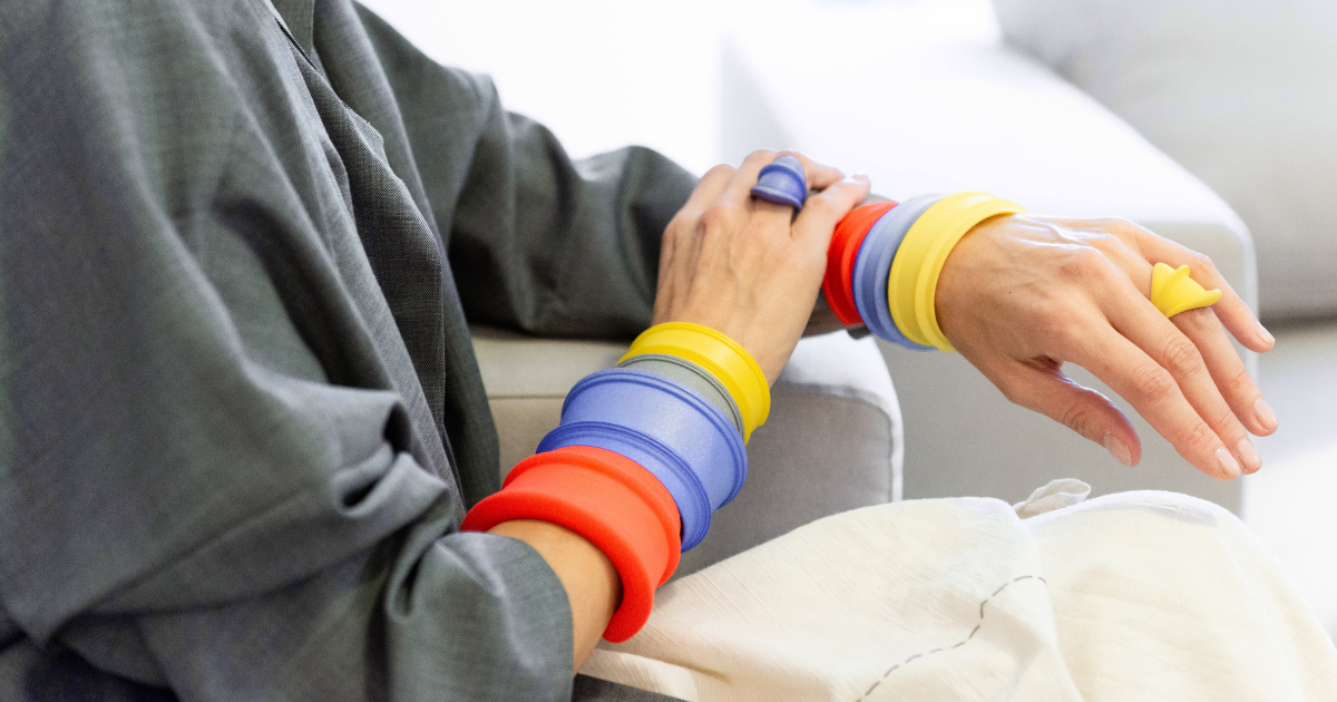
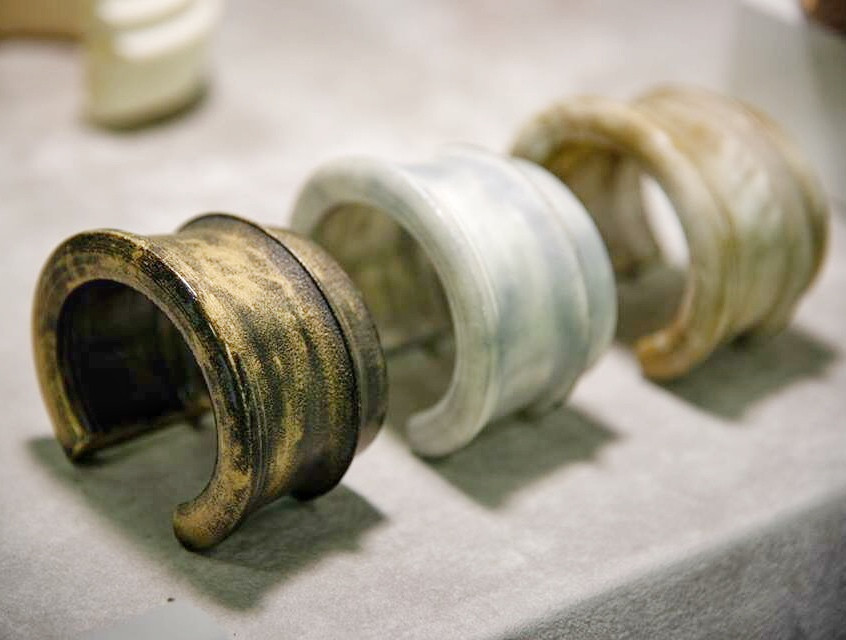
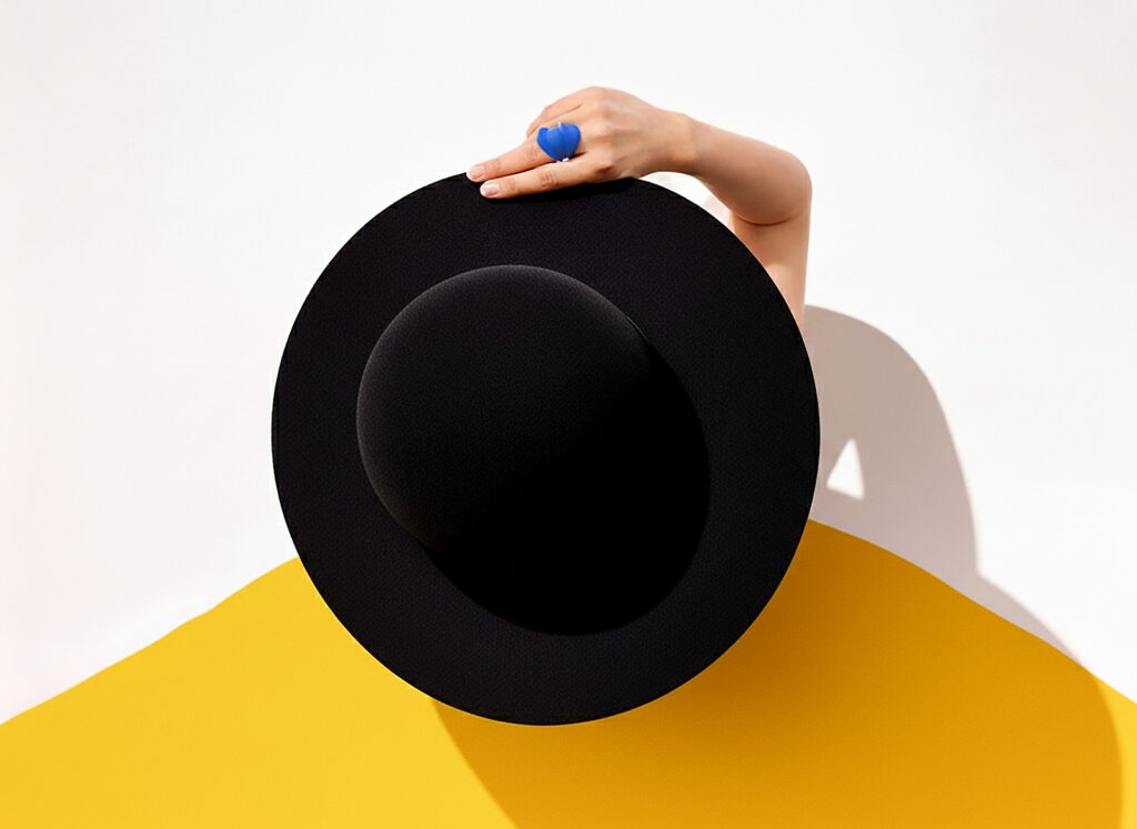
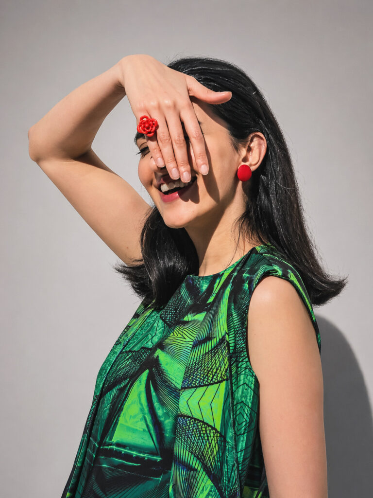
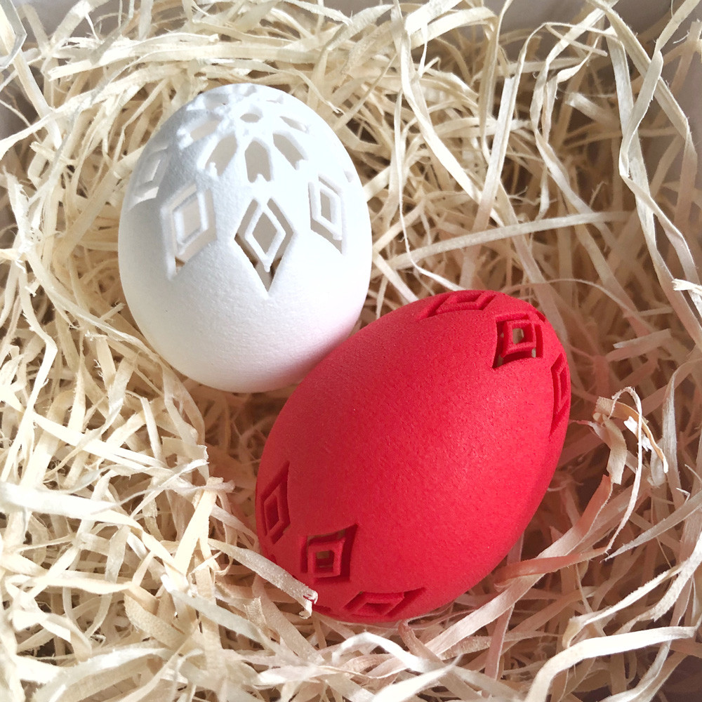
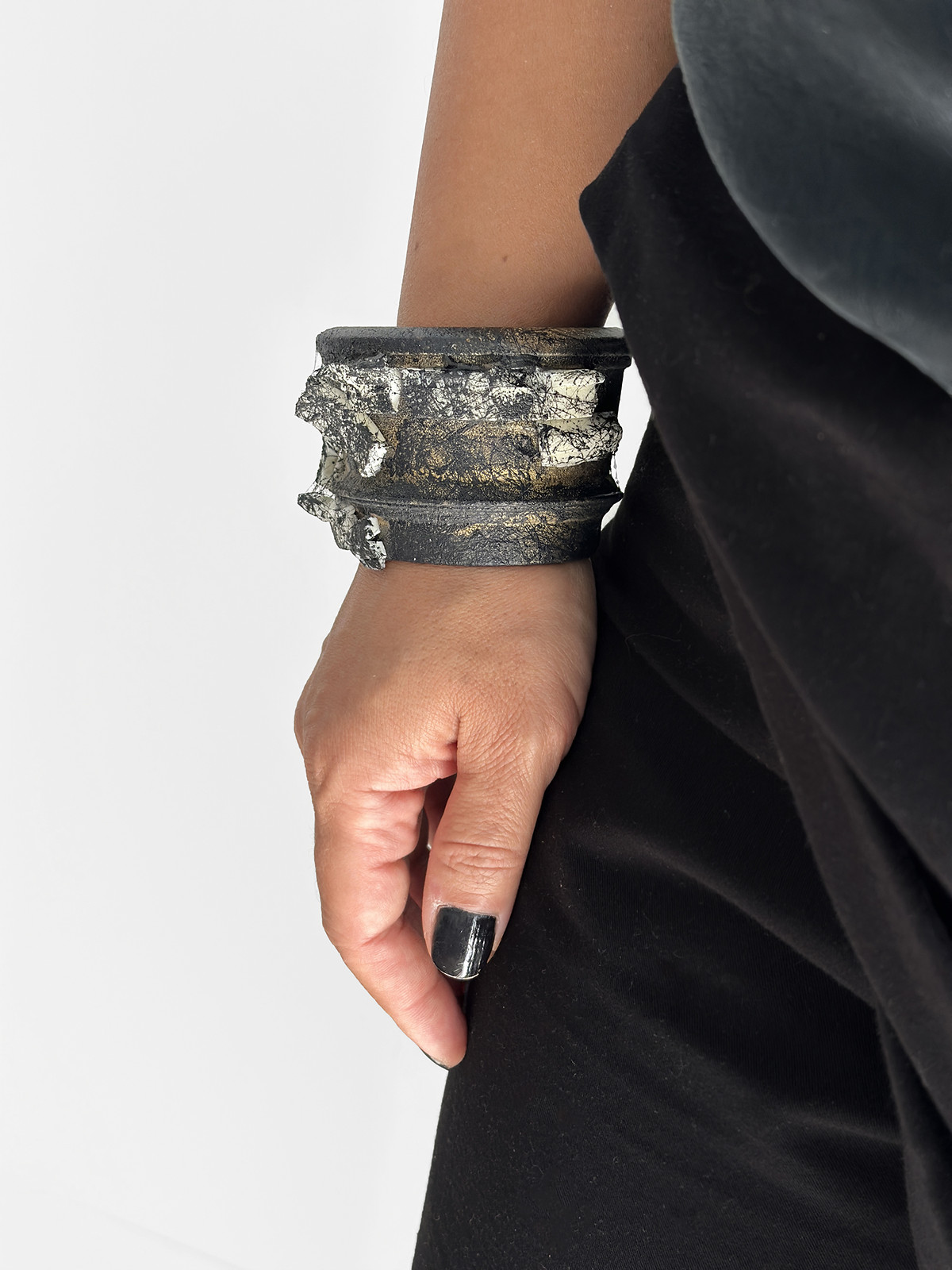
The work spans contemporary jewelry made through laser sintering, sintered nylon PA12 from SLS, hand-finished and pigmented. Decorative design objects. 3D wall art. Digital illustration. Print and digital pieces. Every piece, every series, every collection direction is mine.
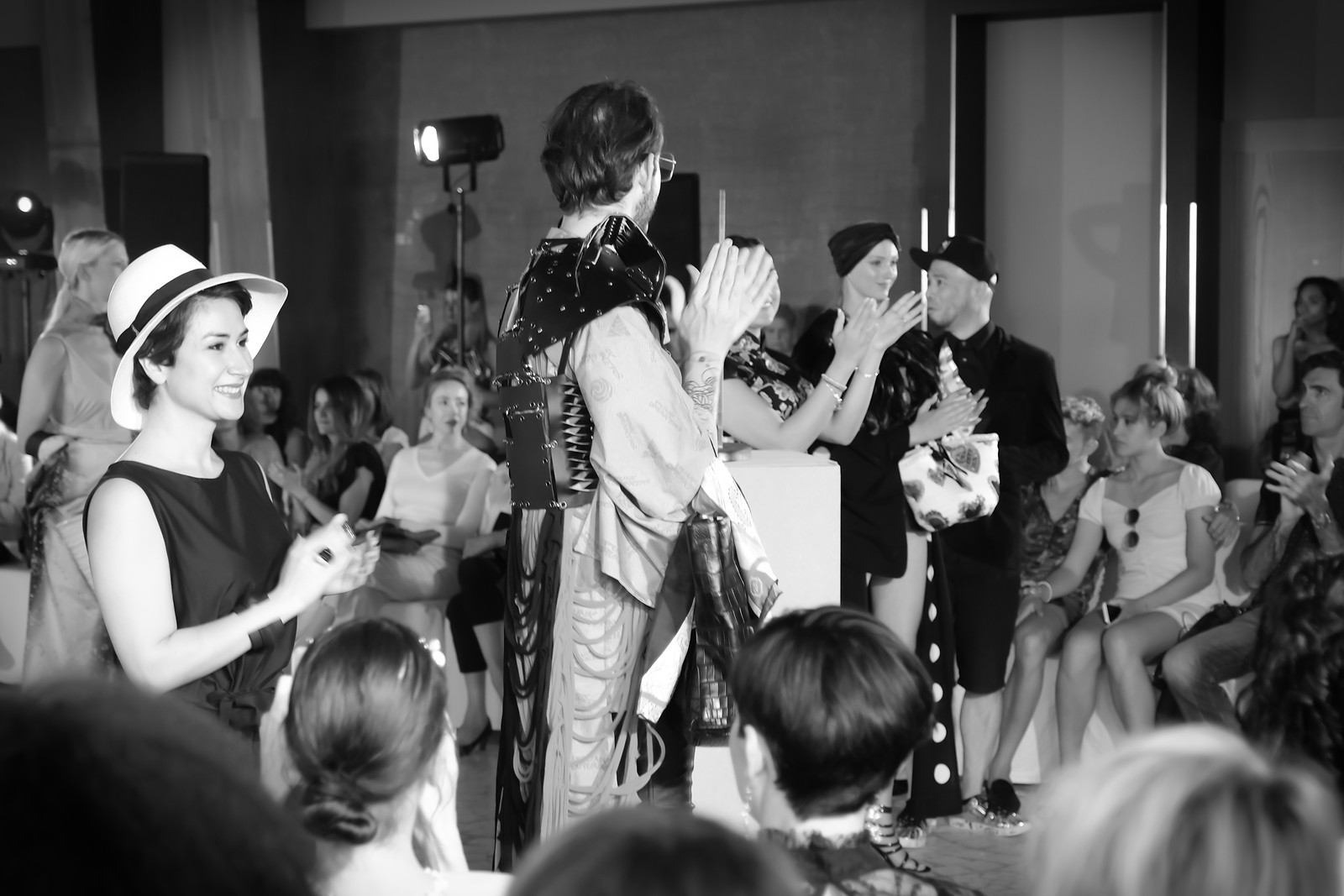
Every decision has been mine too. Product development, brand identity, exhibition strategy, e-commerce, photography, press outreach, social media. The Florence Biennale Special Commendation. The London International Creative Competition Honourable Mention. Presentations at Paris Fashion Week, Milan Fashion Week, and New York Jewelry Week. Exhibitions in Shanghai, Beijing, Amsterdam, Berlin, Monaco, and across Europe and the US. Features in Vogue Talent, Klimt02, and VO+.
None of this was handed to me. I built it.
“When I work with founders, I’m not advising from theory. I’m drawing from lived experience of building something from nothing.”
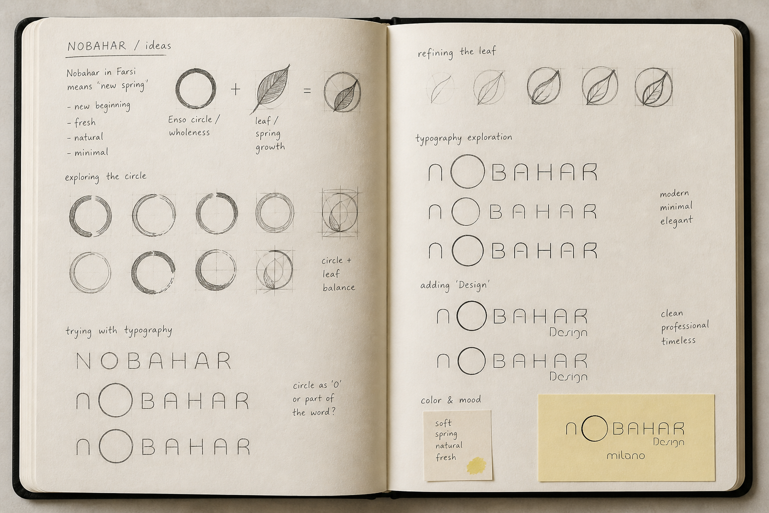
Nobahar in Farsi means new spring. New beginning.
The Logo
The name came first. Nobahar in Farsi means new spring. New beginning. Something fresh breaking through.
That meaning became the design brief.
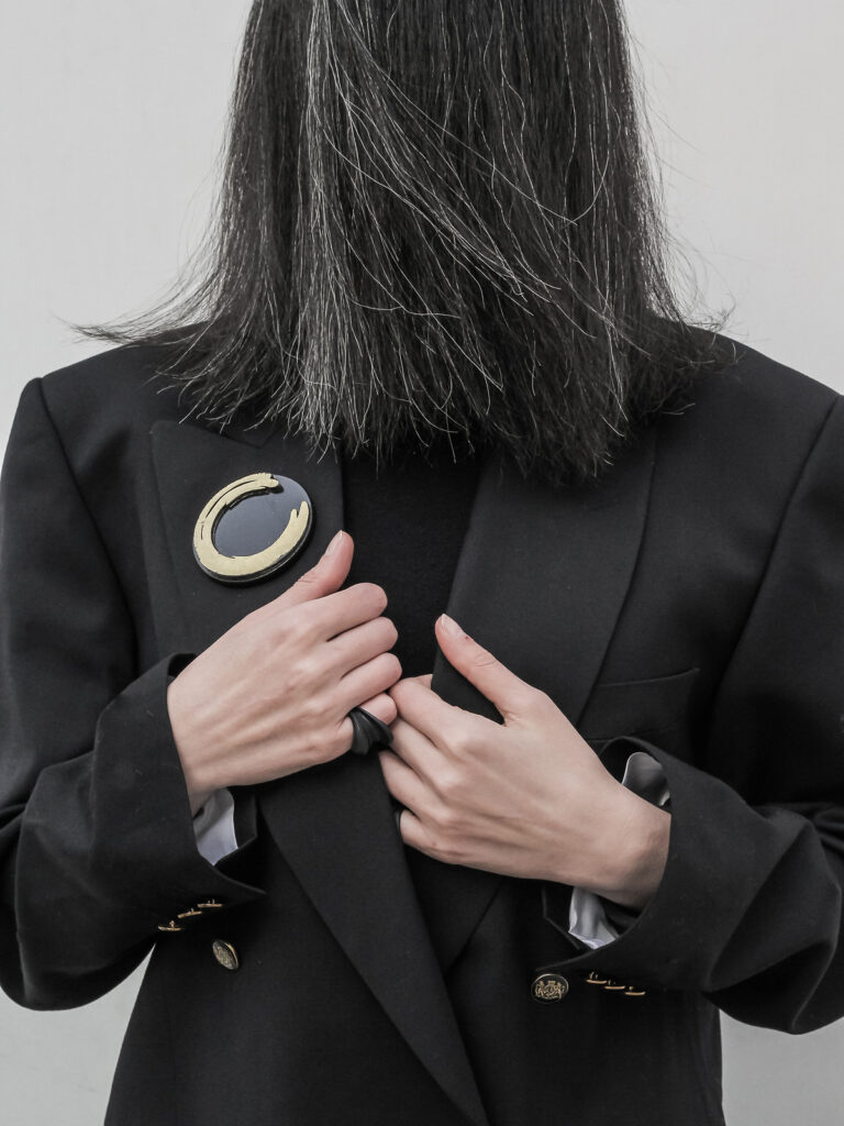
The mark is built from two elements: the Enso circle, a Japanese symbol of wholeness, presence, and the completed cycle, and a leaf, representing spring growth, the first thing that appears after winter. Together they form a single shape, an open circle that holds the idea of renewal inside it.
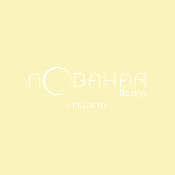
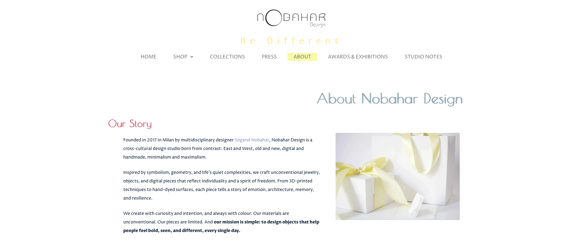
Then the circle becomes the O in NOBAHAR. It doesn’t sit next to the wordmark. It lives inside it, as part of the word. The letter and the symbol are the same thing. The name carries its own meaning visually, without explanation.
Typography: custom geometric letterforms, thin, open, modern. No serifs. No decoration. The word breathes.
The result is a mark that works at every scale, from a jewelry tag to an exhibition wall, from a social post to a 3D-printed piece itself.
The Color
The yellow was chosen for the same reason. Not gold. Not mustard. A soft, pale spring yellow, the color of early morning light in April, of new leaves before they darken, of warmth that hasn’t yet become heat.
It carries the same meaning as the name. Fresh. Natural. Present. A color that doesn’t announce itself, but stays.
Paris. Milan. New York.
Amsterdam. Berlin. Shanghai.
Beijing. Monaco. Florence.
Venice. Bucharest.
Fashion weeks, jewelry weeks, design weeks, biennales.
Fifty exhibitions in twenty countries since 2017.
Florence Biennale, Special Commendation, 2023
SNAG “Revolution”, selected among 55 from 230 submissions, 2023
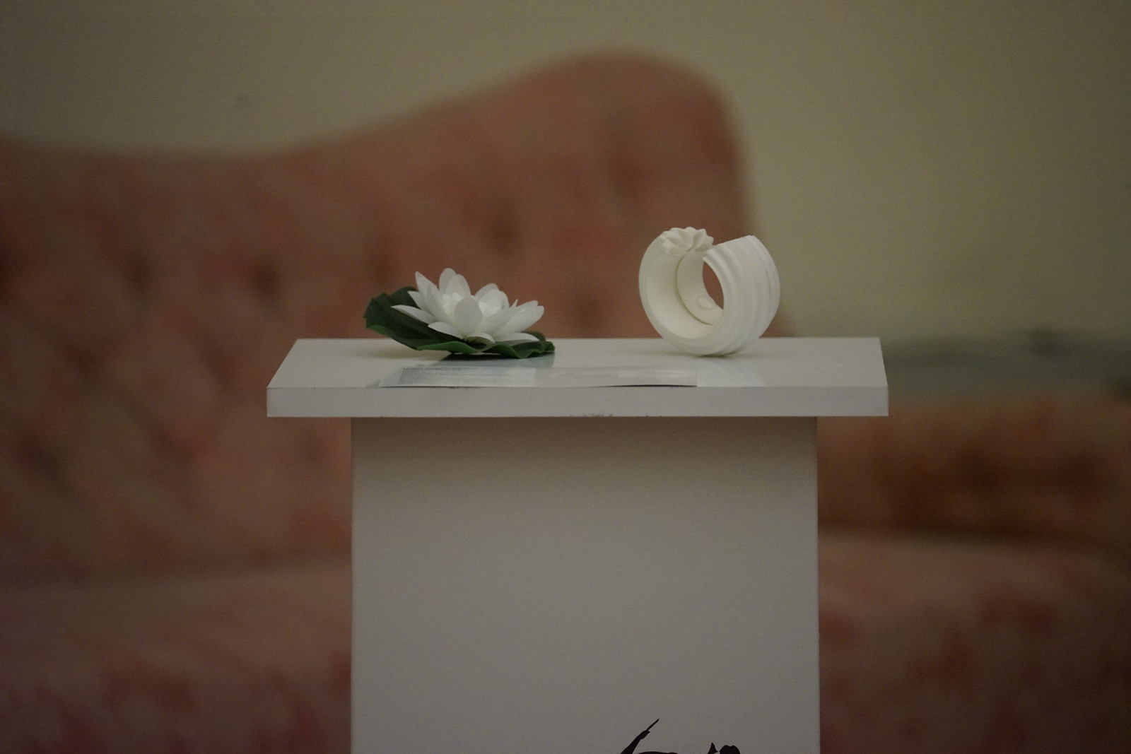
London International Creative Competition, honourable mention, “The Rebirth of Lotus” cuff, 2019
Milano Jewelry Week, Avanguardia Wunderkammer Selection, 2019
Featured in Vogue Talent, Klimt02, VO+, and more.
PERSISTENZA, again & again
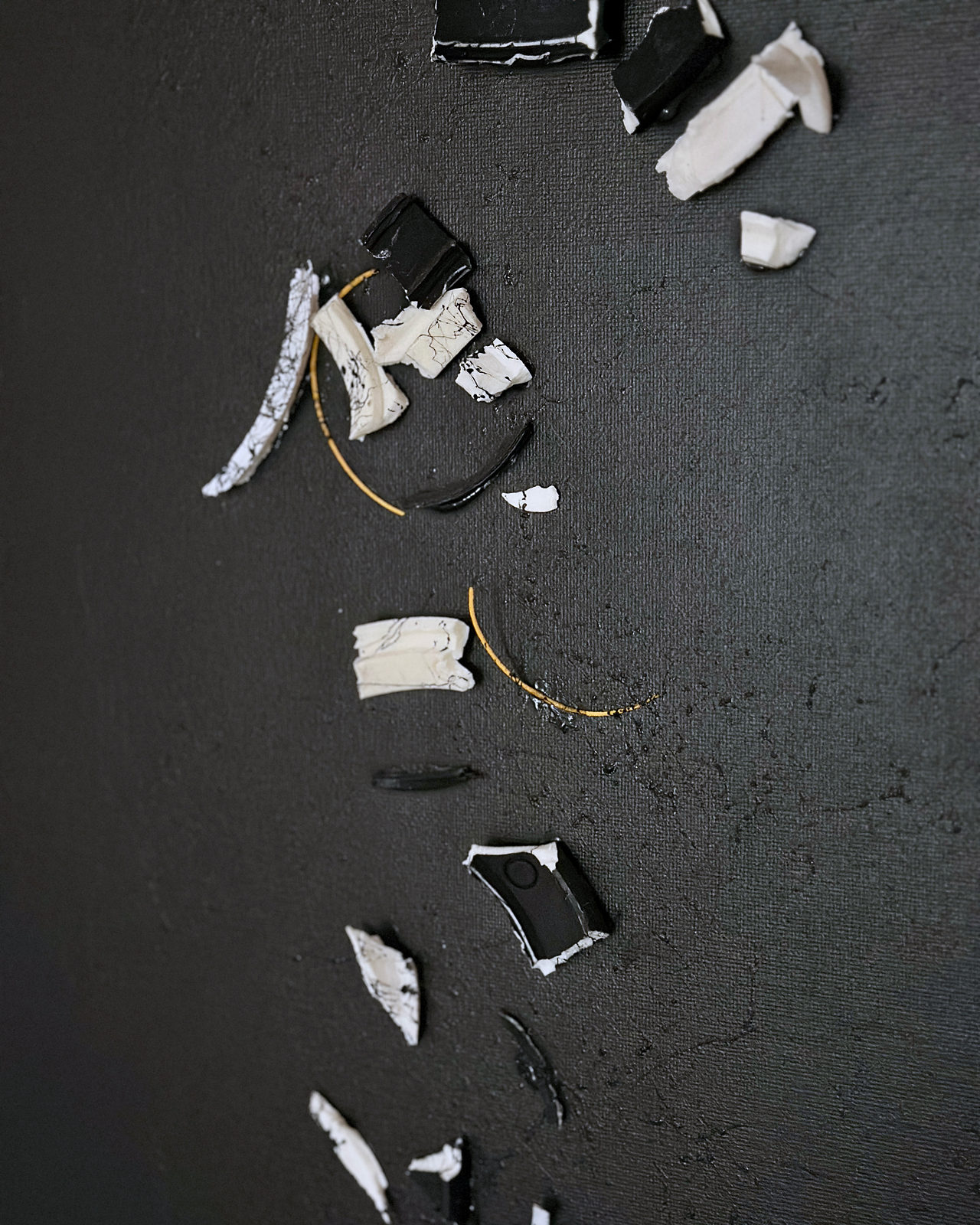
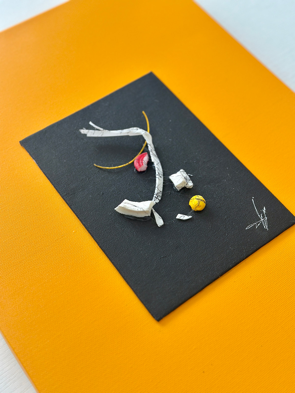
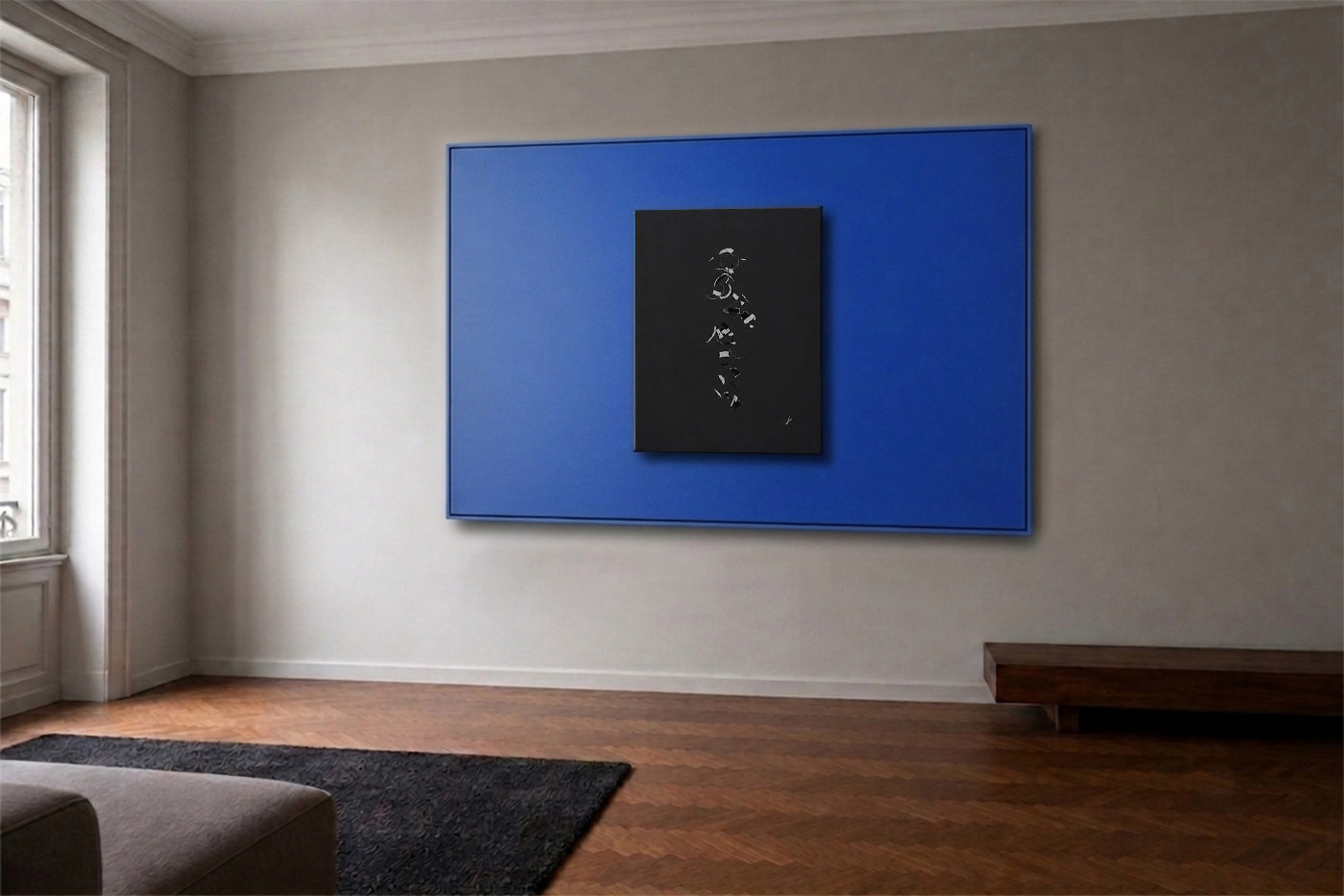
One hundred one-of-a-kind pieces, made by breaking my own archive apart and putting it back together differently.
I started it after a hard year. The idea was simple and not comfortable. Break the work I had already made, and build from what was left. The pieces are cut, broken, and put back wrong on purpose. What comes out is not a repair.
Each piece is numbered and permanent. A certificate travels with it, physical and on-chain.
→ Read more on nobahardesign.com
I don’t advise founders from theory. I’ve built a brand from nothing, three times, and I’m still doing it.
Vuoi parlare del tuo brand? → Scrivimi un messaggio