MUSEO DEL BIJOU DI CASALMAGGIORE
Exhibition Design · Spatial Design · Recovered Materials · Macro Photography · Art Direction
Casalmaggiore, Italia · 2022 and 2023
Three hundred glass jewels. A display built from glass nobody thought was precious.
The Challenge
In 2022 the United Nations declared the International Year of Glass. The Museo del Bijou di Casalmaggiore, the only museum in Italy dedicated to bijou, marked it with over three hundred pieces from private collections and its own archive. Two centuries of Italian glass jewellery, curated by Bianca Cappello and Augusto Panini, under the patronage of the Comitato Nazionale Italiano AIHV.
Bianca Cappello called me before the design existed.
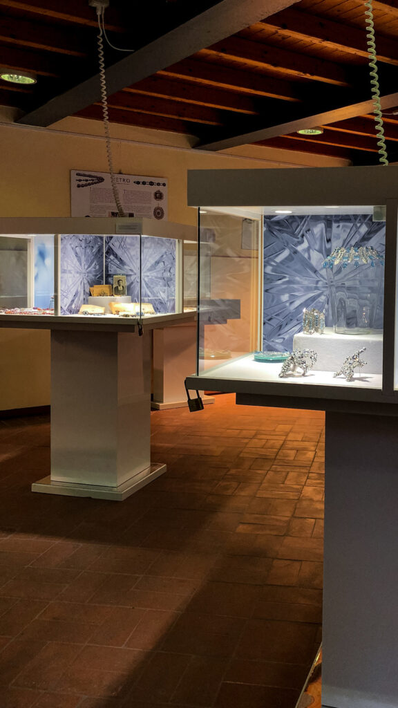
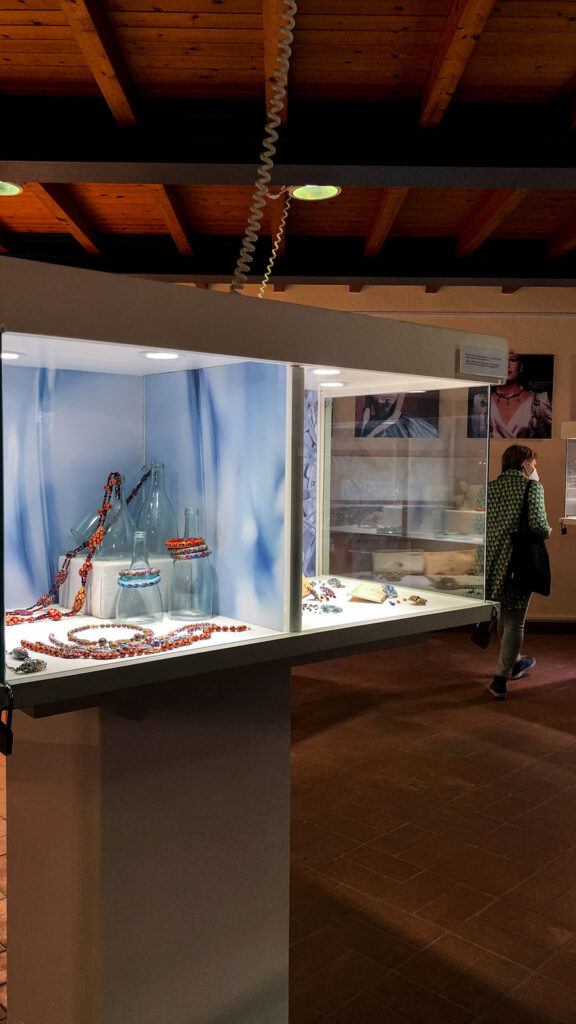
What the museum had was six mushroom vitrines, each divided into four sections of roughly fifty centimetres, and six rectangular tables. What it had to display three hundred pieces on was white fabric supports and black plastic heads.
She wrote that she wanted something different and astonishing.
She already had ideas. Modular crystal sheets stacked into levels. Recycled glass recovered from processing plants. Offcuts from foundries. Glass bricks she had found online. The bricks cost too much and the rest needed a supplier. There was no budget for new casework.
I did not use any of them.
“Looking for something magnificent that is right there, just out of sight.”
“La ricerca di qualcosa di magnifico che è proprio lì, appena fuori dalla vista.” From the project moodboard, written before the first bottle was cut.
The Material
The catalogue for the exhibition opens on the idea that a glass artwork is precious above all because it is unique.
I went the other way. I looked for the glass object nobody considers precious at all.
The bottle. Thrown out by the crate, every day, everywhere. It is also the oldest container for something worth saying. A message in a bottle is an older idea than any piece in that room.
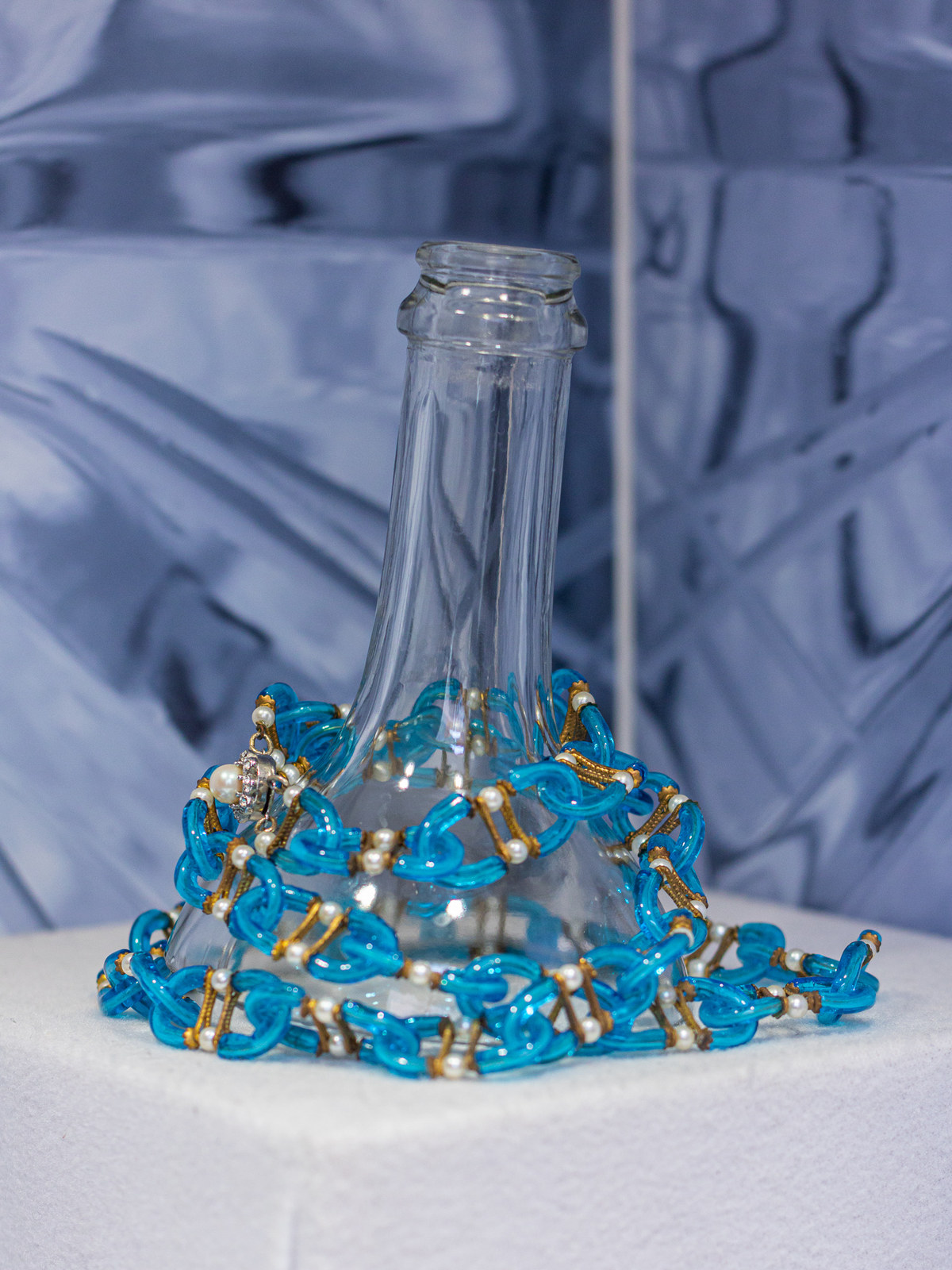
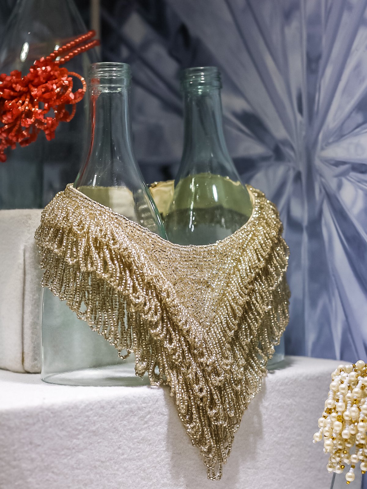
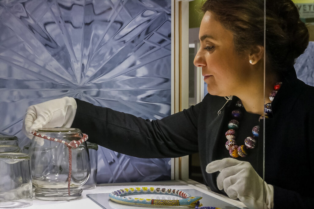
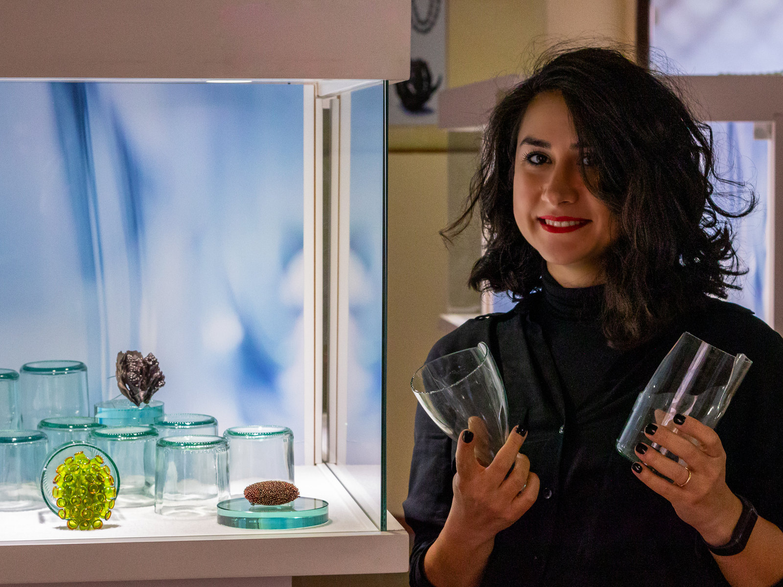
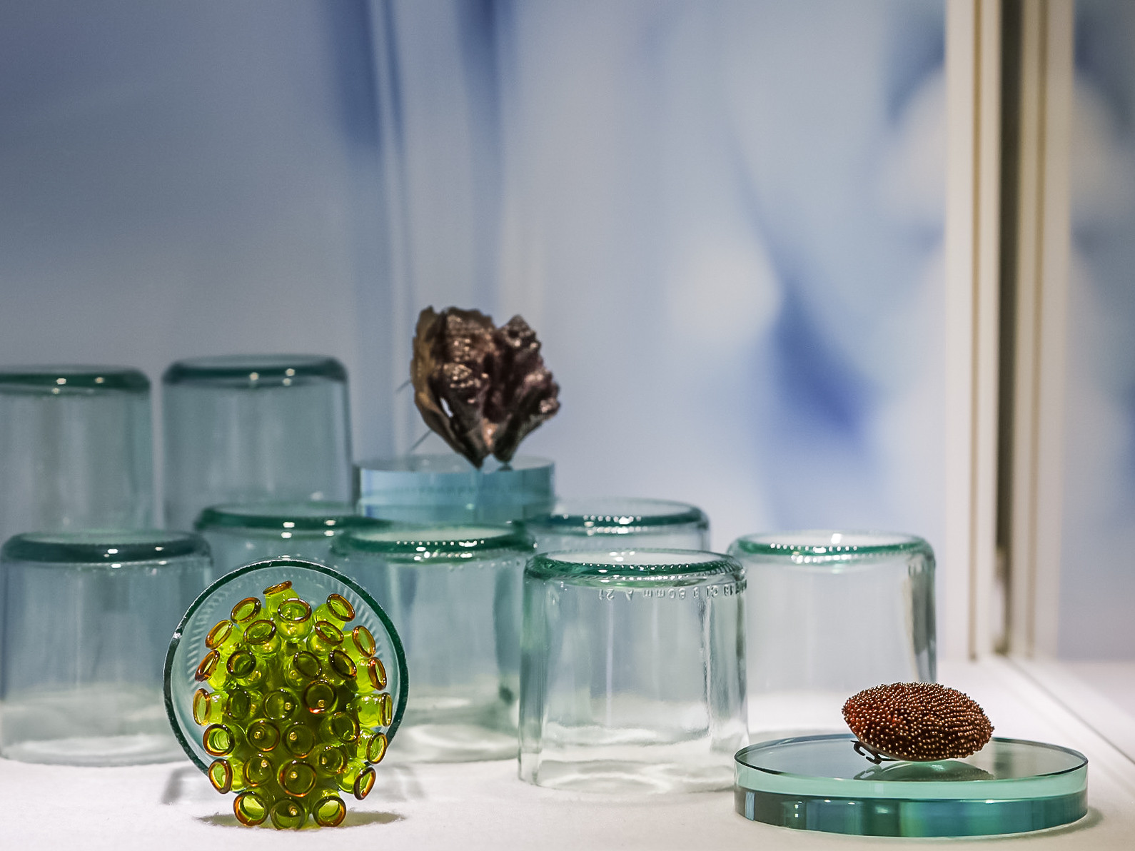
Discarded glass holding collected glass. Same substance, different stage of its life, and the visitor reads both at once without being told.
Collecting
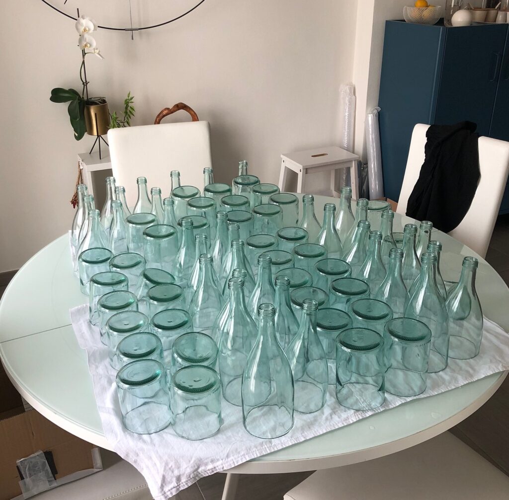
Sixty bottles, from bars and from neighbours.
Green, clear, blue. Different shoulders, different necks, different bases. The range of shapes I could collect was the range of supports I would have, so the collecting was already the design.
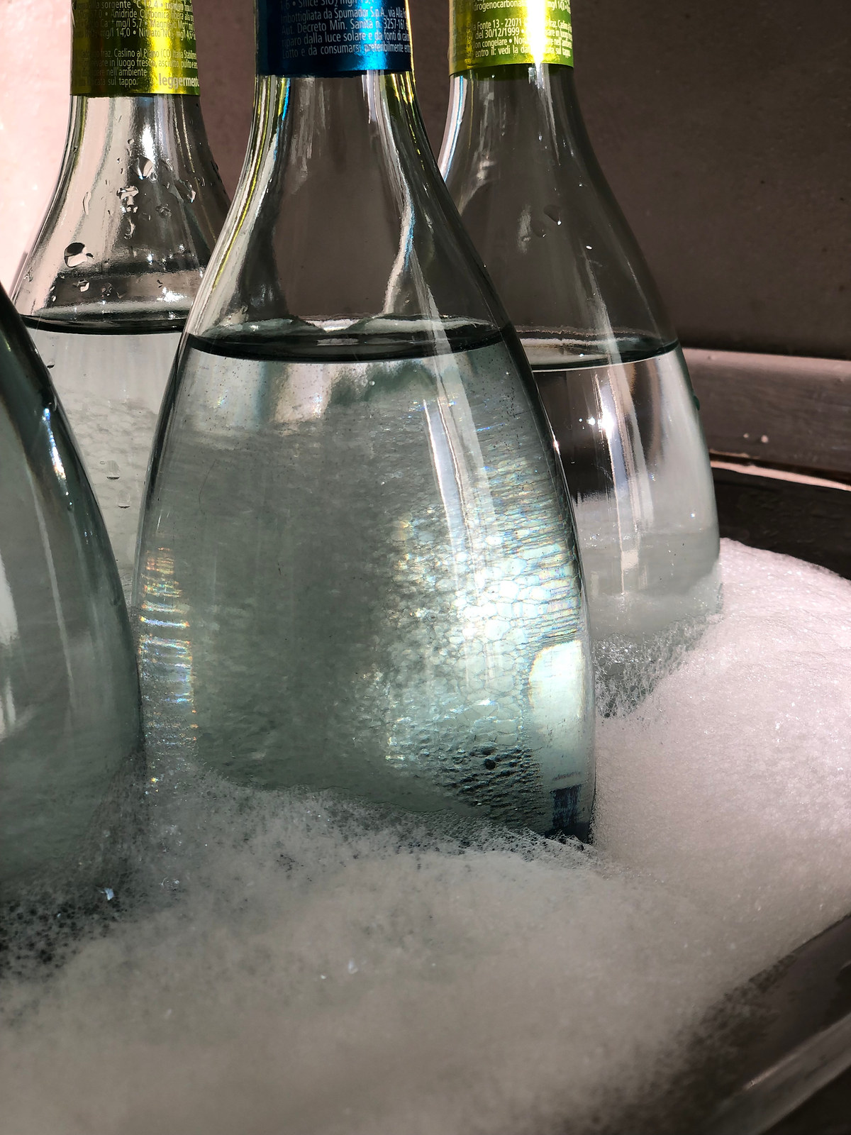
Washed by hand. Labels off, glue off, glass clear enough to sit under museum light.
Cutting
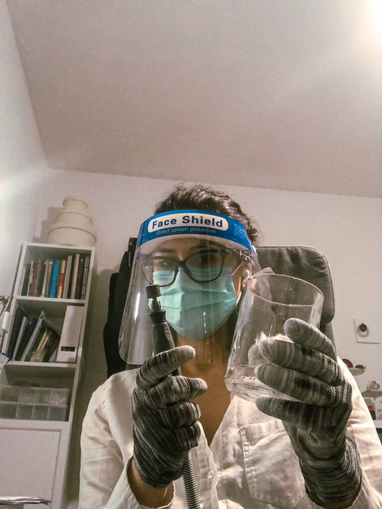
Cut with a face shield and cut-resistant gloves.
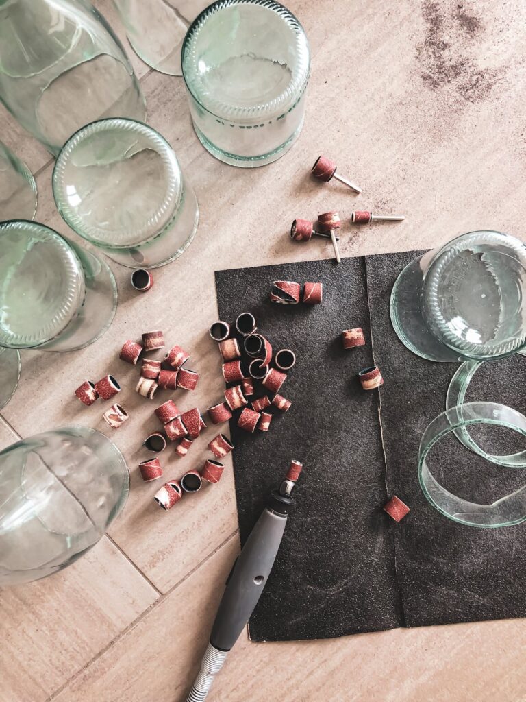
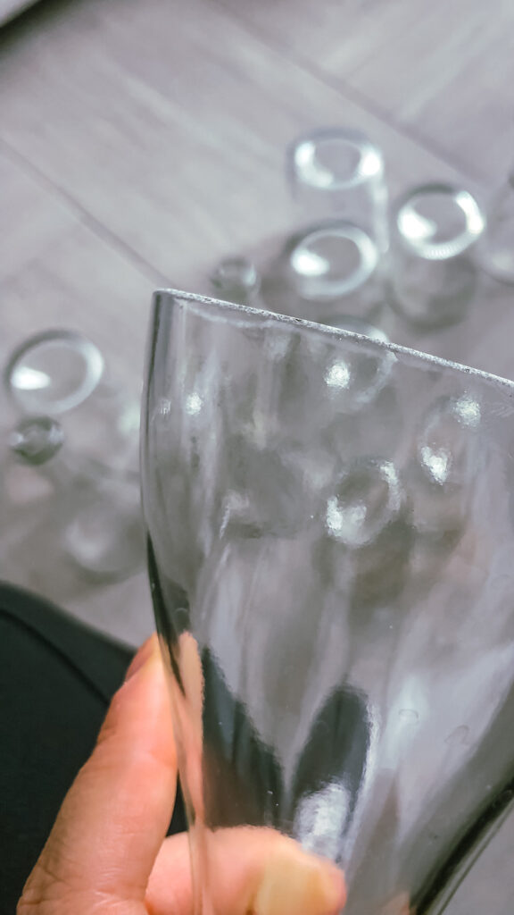
Every edge ground by hand. Sanding drums on a rotary tool first, then finer, until the rim was safe to touch and true enough to sit flat.
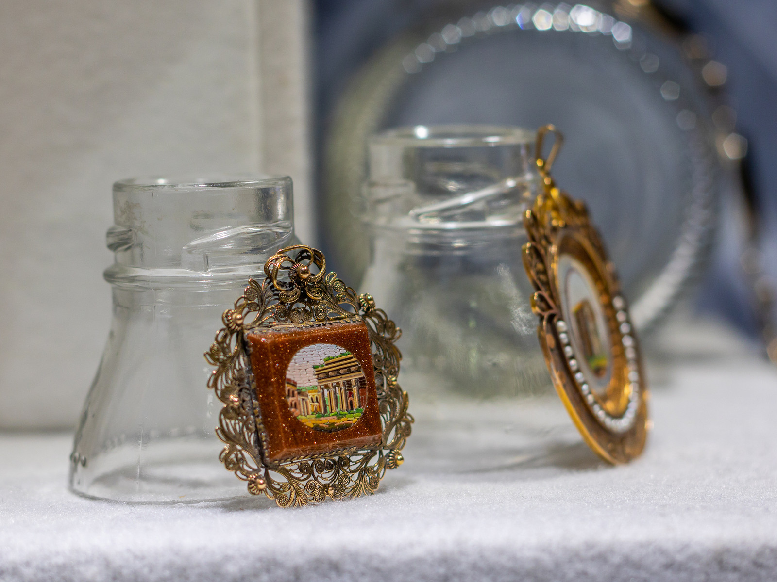
The cut cylinder became a plinth. The base became a disc. The neck held what would otherwise have lain flat on fabric. Twenty-two discs at eight centimetres among them, counted before they were cut because the layouts were already drawn.
The Background
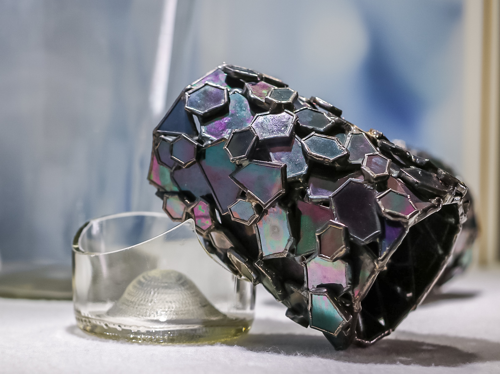
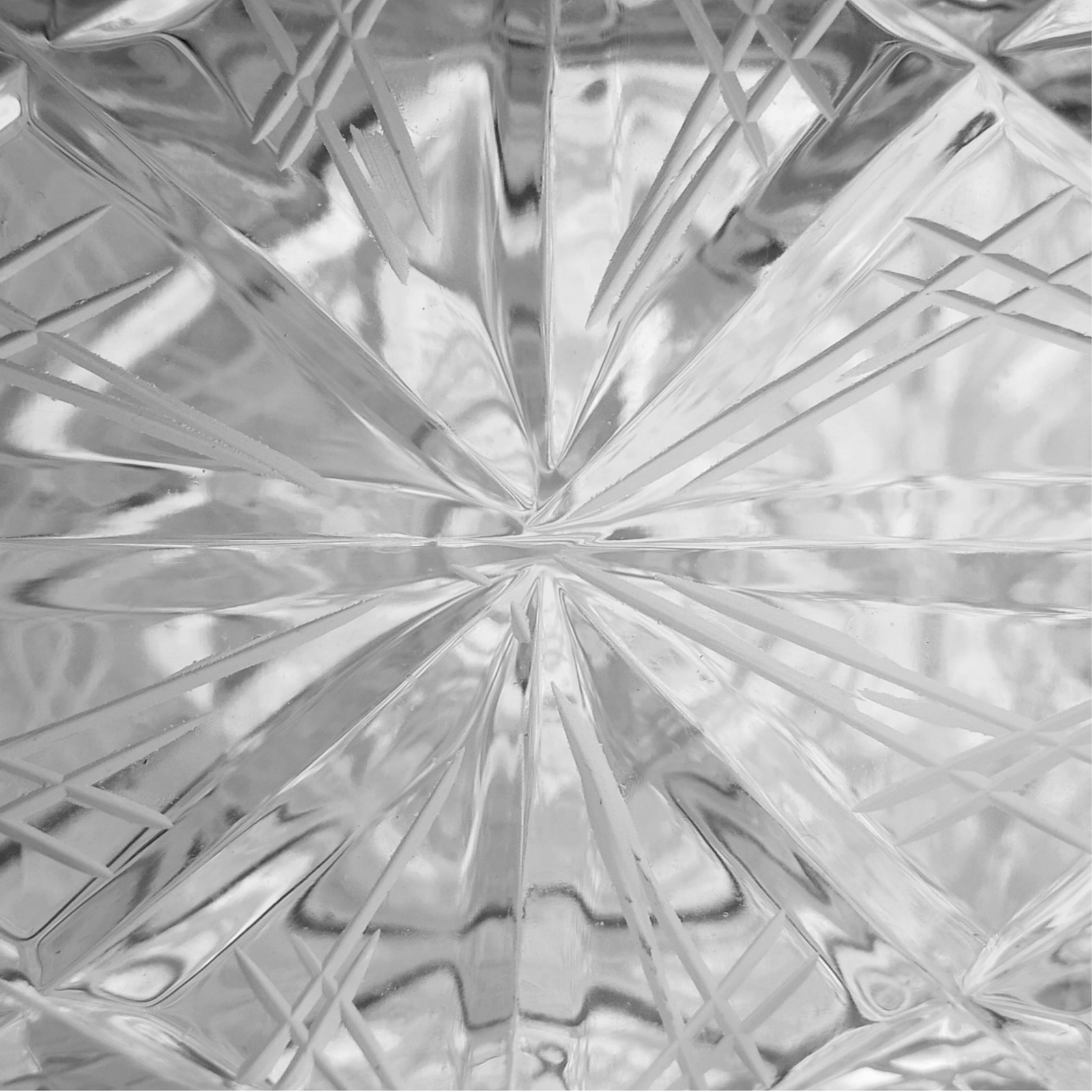
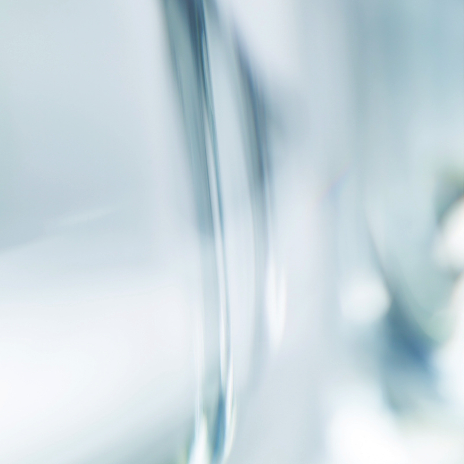
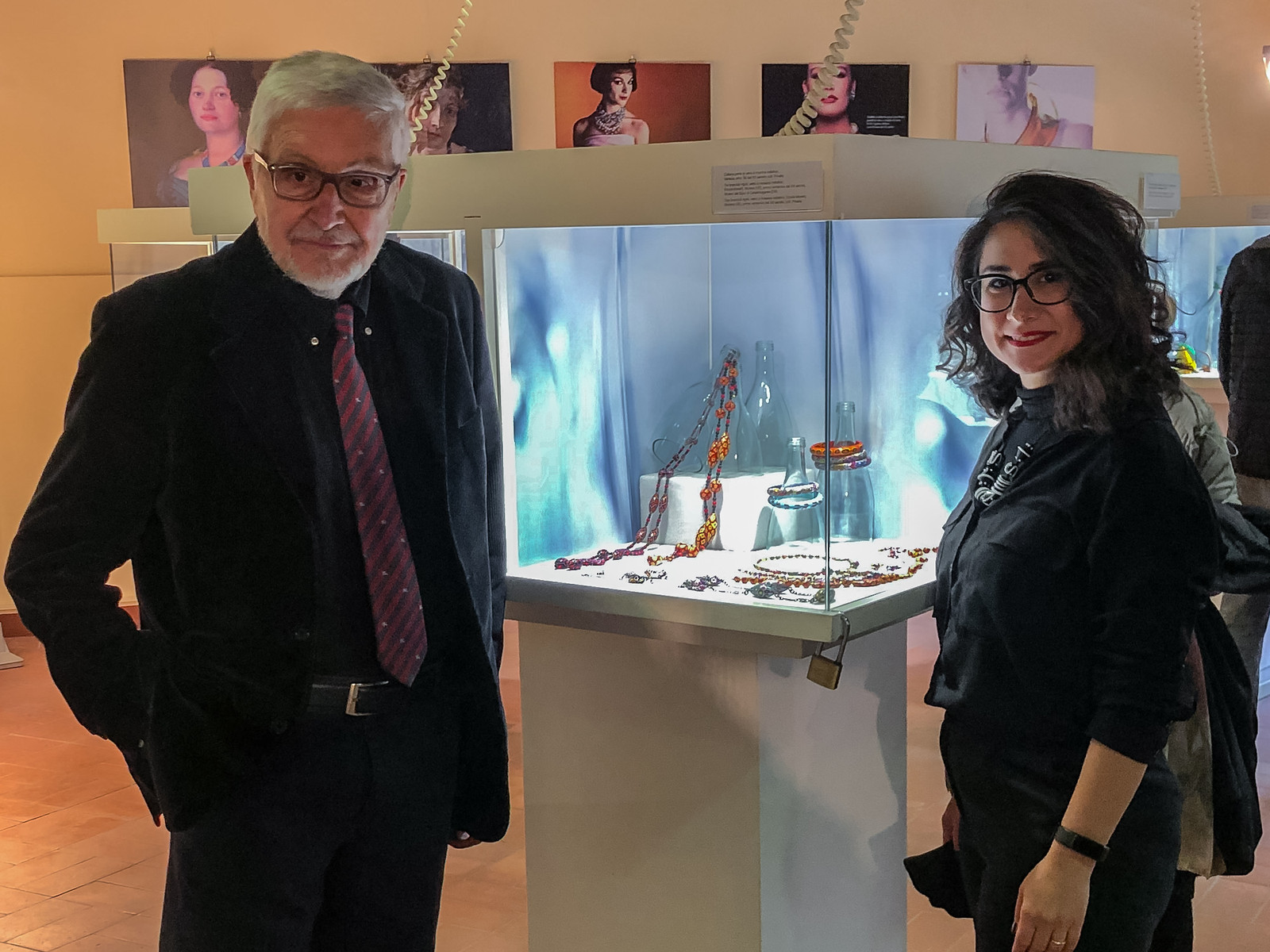
Then the third register. Macro photographs of glass, printed and mounted as the backgrounds of the vitrines. Cut crystal. The curve of a bottle in blue.
At that scale glass stops being a container and becomes a landscape. The jewels sit in front of it.
Discarded glass underneath. Magnified glass behind. Precious glass in the middle.
The System
The brief asked for the interior of one module of each type, as a template.
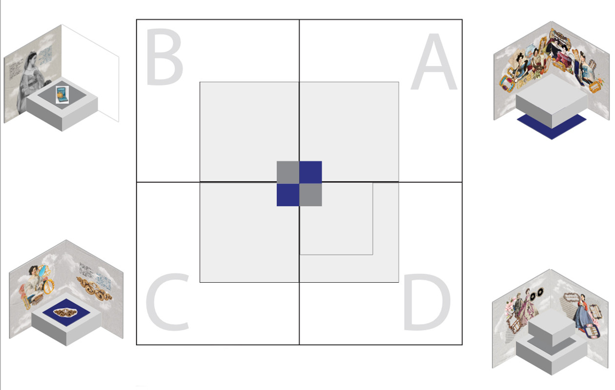
I delivered a system instead. Scheme A and scheme B alternating across the four quadrants of every mushroom vitrine, with the backgrounds swapping between them. Four variants for the tables.
Six vitrines, twenty-four quadrants, no two identical, built from one kit of parts.
What Happened
The exhibition opened on 23 April 2022 and ran to 9 October, extended to 16 October.
Credited in Arte.it, Il Giorno, FashionNetwork, L’Orafo Italiano, Preziosa Magazine and 18 Karati.
Then the museum called again the following year.
The Second commission: Milleuna Fibbia, dal Settecento alla Dolce Vita.
28 October 2023 to 17 March 2024.
Buckles from the Pennasilico collection, from the eighteenth century to the Dolce Vita. Curated by Bianca Cappello and Samuele Magri.
Same rooms. Same six vitrines, same six tables. A different problem.
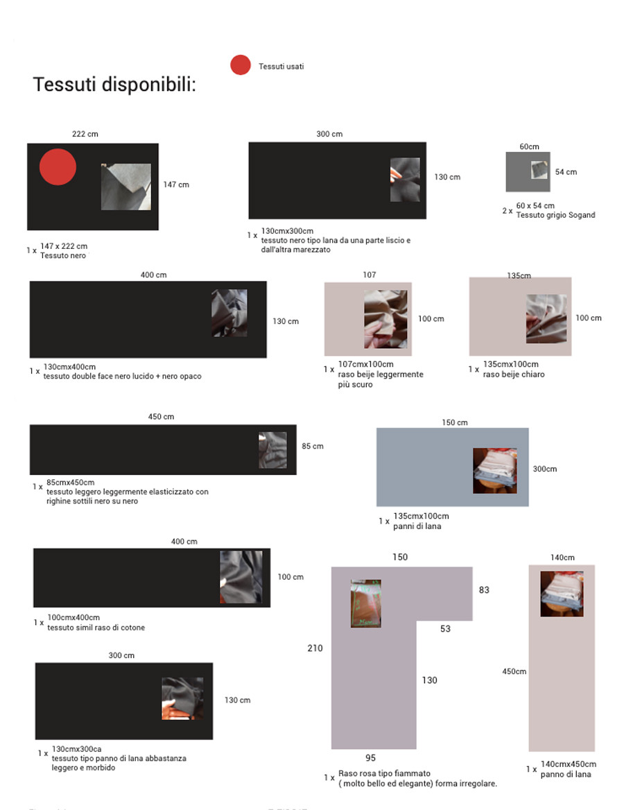
Both times I started the same way, by writing down what already existed. For Vetro that list was six vitrines, four quadrants each, white fabric and black plastic heads. For Fibbie it ran longer. Thirty large cubes and twenty small ones, all 10.3 centimetres high. Every usable fabric in my house measured and photographed, with a mark on the ones already spoken for. Nothing was designed until the inventory was finished.
Infilata nel Tempo
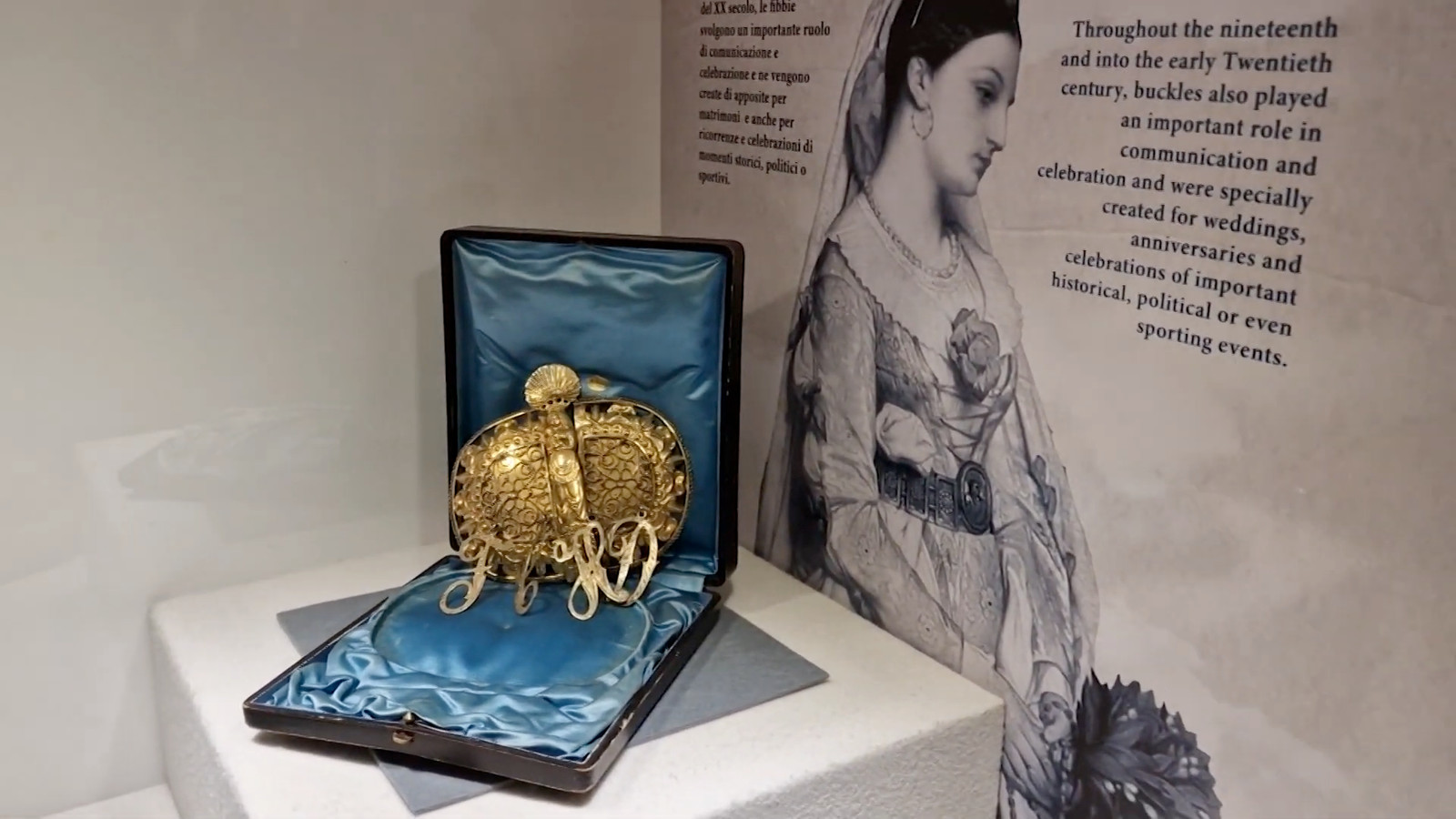
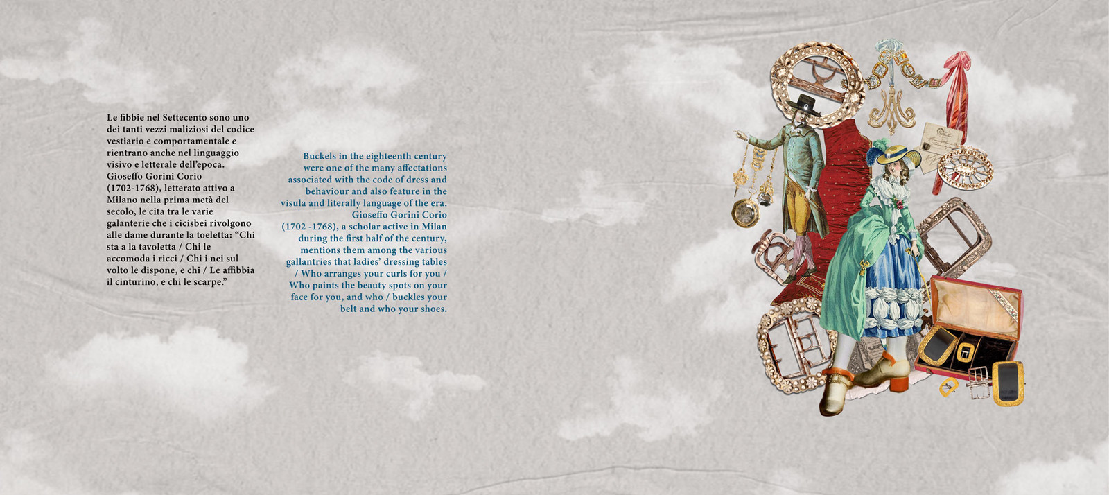
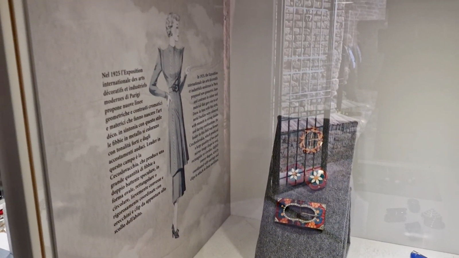
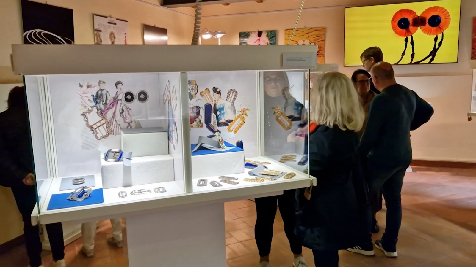
A collage for each period. Buckles set against the figures who wore them, printed as the panel standing behind each display.
I used illustration rather than photography. It carried the mood of the period better, and it removed the image rights problem that period photographs would have created for the museum. The design decision and the legal one were the same decision.
The colour
Italian in black, English in blue, on every panel.
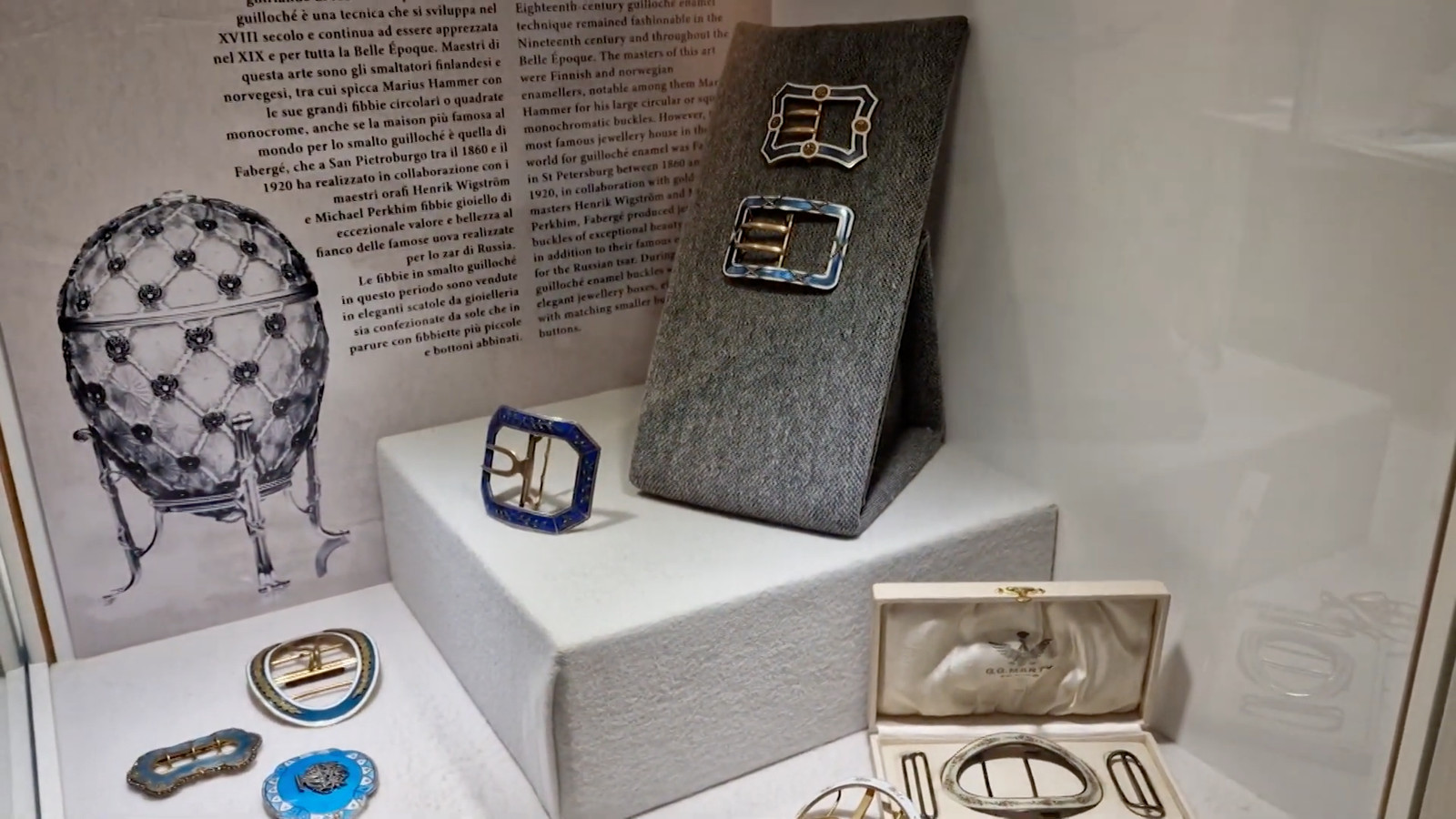
Blue felt and pale blue felt placed on the side opposite the blue text, never underneath it. Grey everywhere else, because grey does not compete with a buckle.
Twenty-four quadrants and six tables keyed like that, drawn before anything was cut.
The material, again
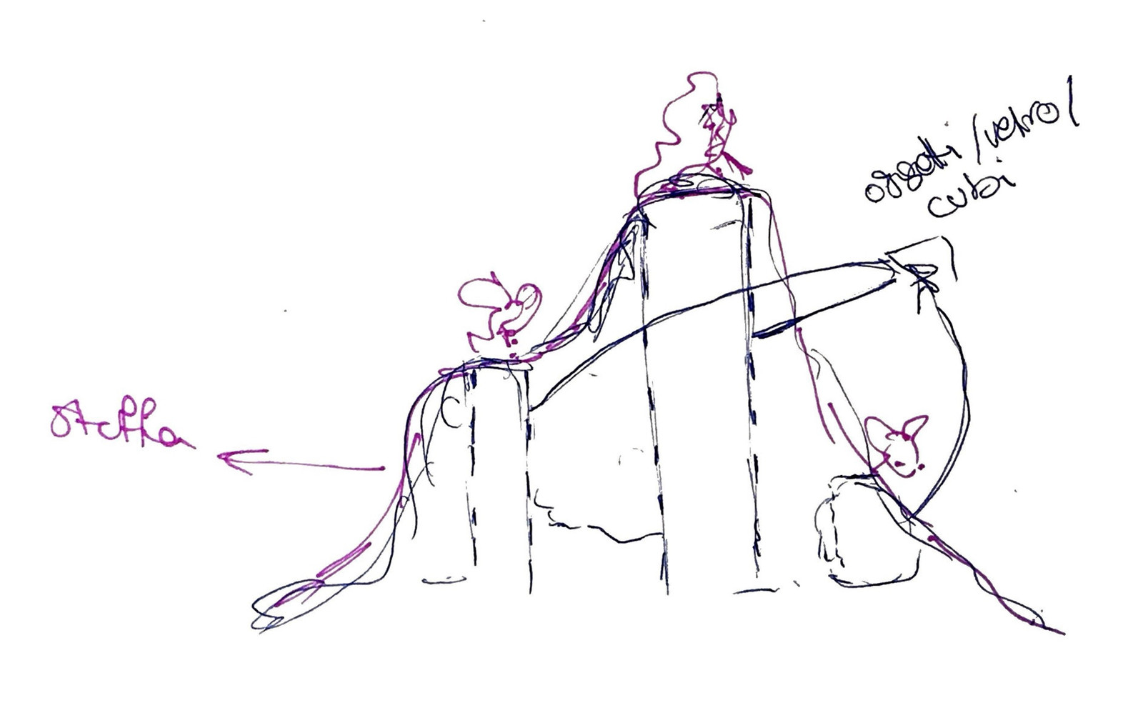
The bases are cardboard and fabric. Wedges, risers, flat pads, cut to the object that would sit on them.
The felt was bought. Six blue, seventeen grey. Everything else came out of my own cupboards.
The museum bought no casework for this one either.
Identity is spatial. It is felt, and it occupies space the way an object does. This is the version of that idea you can walk around.
Want to talk about your brand? → Drop me a line