Visual Identity · Logo · Business Card · Website · Personal Branding Photography
Milano, Italia · 2019 & 2021
Designed in 2019. Still in use, unchanged.
The Brief
Bianca Cappello is a jewellery historian, critic and writer. She teaches at IED and at the Galdus goldsmith school in Milan, and curates History of Jewellery seminars for academies and universities.
There is no product. No company, no collection, nothing to sell. What she has is a name and an eye, and both of those live in other people’s exhibitions, other people’s books, other people’s lecture halls.
So the identity had to work everywhere she is not present. A book spine. A seminar slide. A museum wall panel. A footer credit under a catalogue essay. Small, quiet, and unmistakably hers at any size.
The Mark
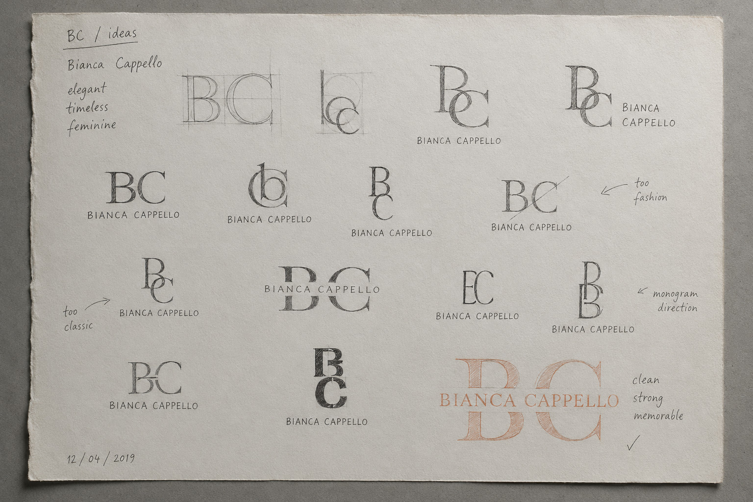
Two words on the exploration sheet rule out more than the fifteen drawings do. One option is marked too fashion. Another is marked too classic.
That is the whole problem. Too fashion and she reads as a brand. Too classic and she reads as a heritage house. She is neither. She works with contemporary makers and eighteenth-century buckles in the same week.
The mark that survived sits between the two failures.
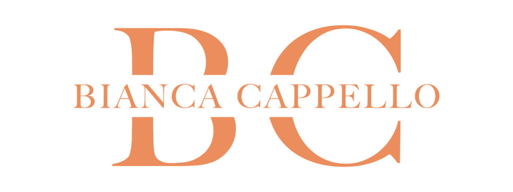
Two letters, B and C, overlapping, in a high-contrast serif with classical proportions. The wordmark crosses through the middle of them. It does not sit underneath.
Read one way it is a monogram with a line of text laid across it. Read the other way it is her full name, with the initials standing behind it at scale. Both readings are correct, and which one you get depends on how far away you are standing. Close, on a card, the name. Far, on a wall or a spine, the monogram.
Exploration sheet. April 2019.
The mark at full size.
The tonal version, for watermarking.
The colour
Not gold. Gold is where jewellery goes by default, and gold would have placed her beside the objects instead of in front of them. She does not sell jewellery. She dates it, authenticates it, writes about it and decides what it means.
Coral instead. An Italian material with its own history, worked in Torre del Greco for four hundred years, and one she would recognise on sight. Warm, organic, worn rather than mined. Not a precious metal.
PMS 475. #F08E63.
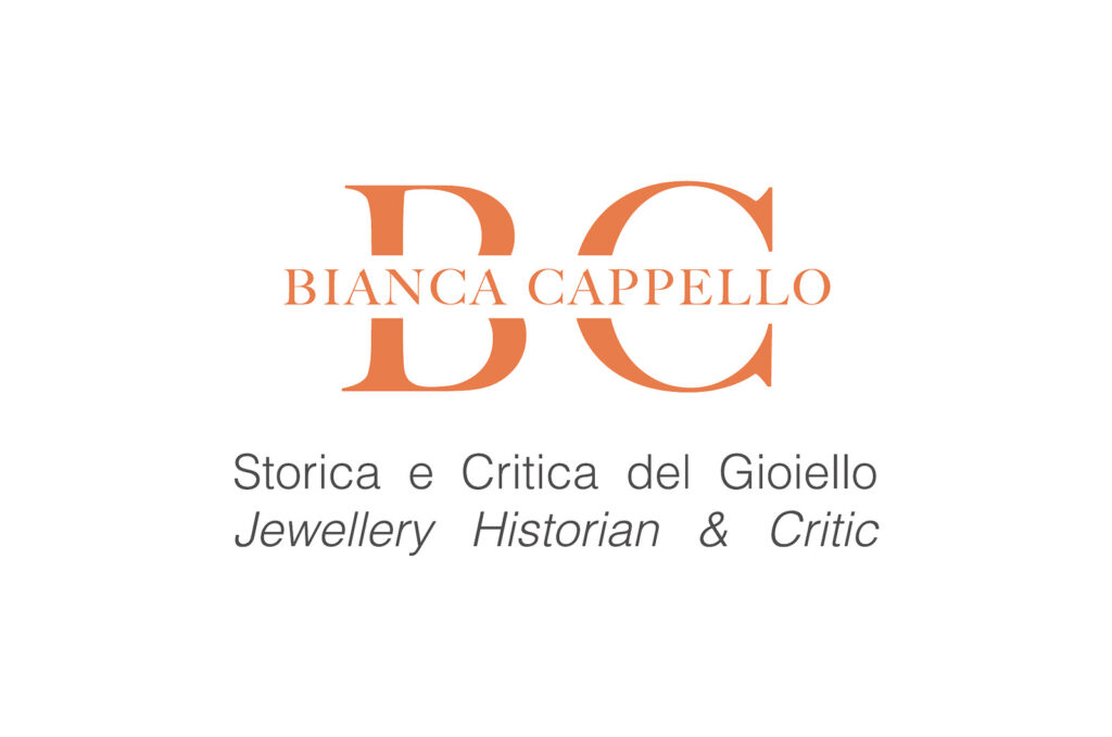
Business card, front, 2019.
Business card, back, 2019.
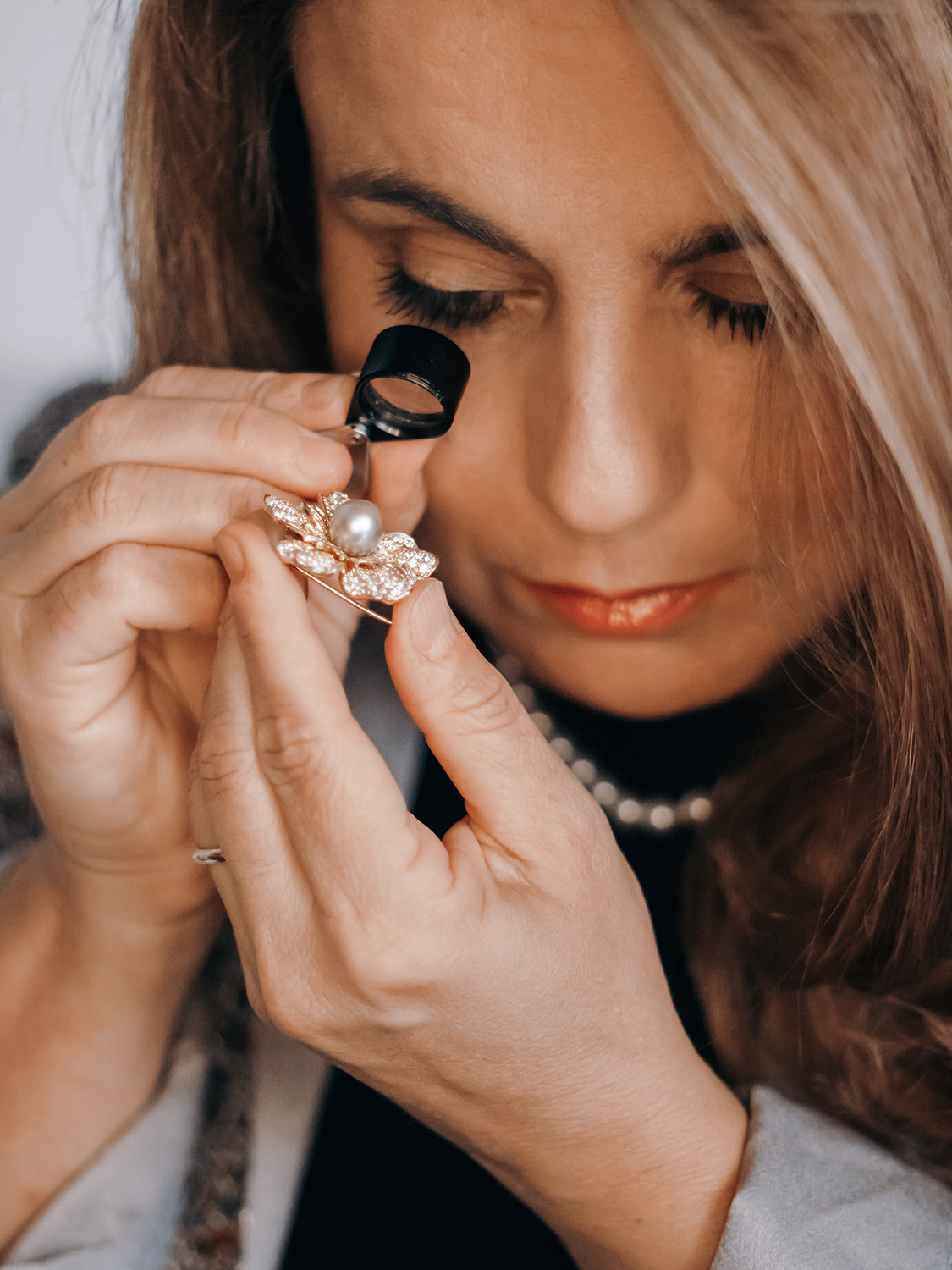
The Photographs
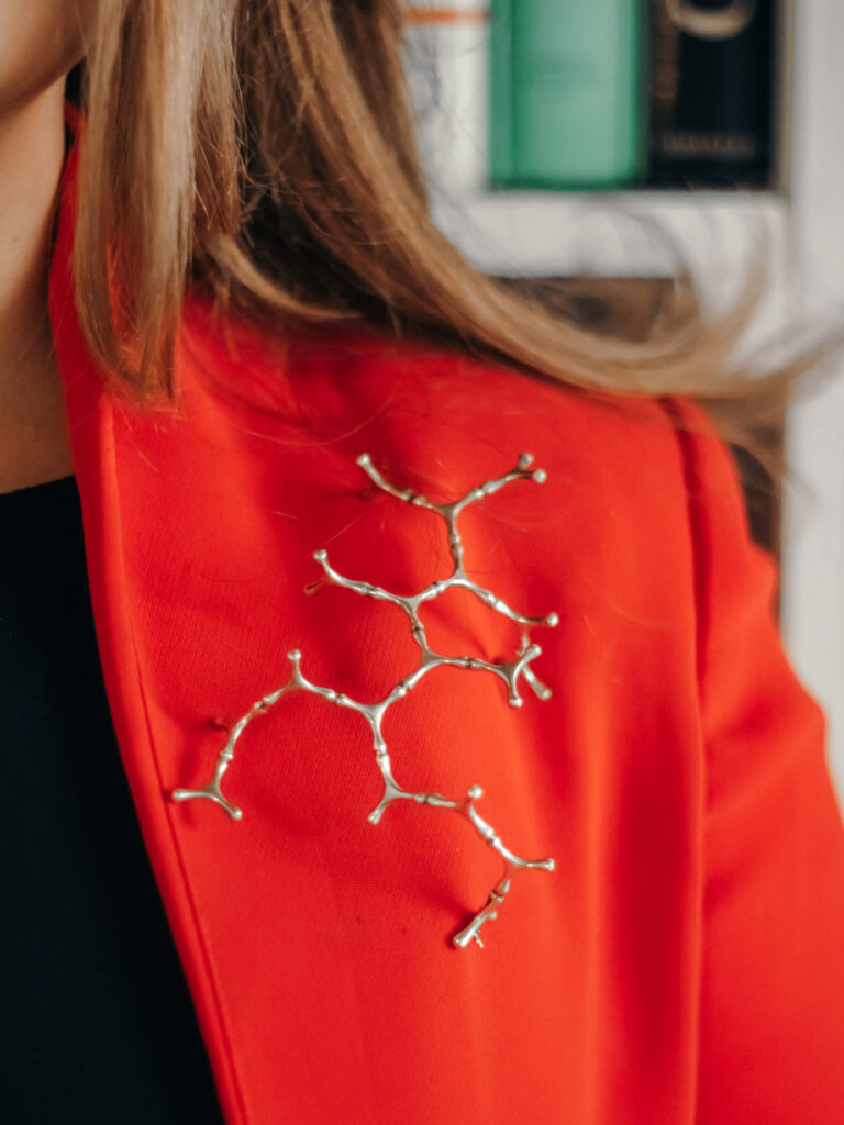
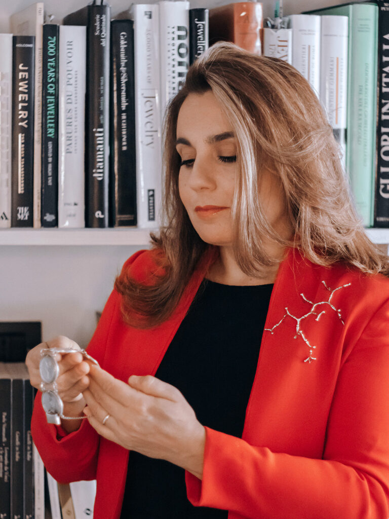
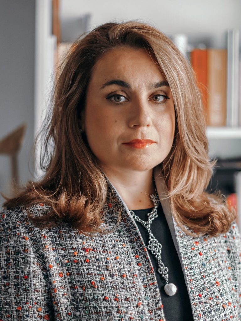
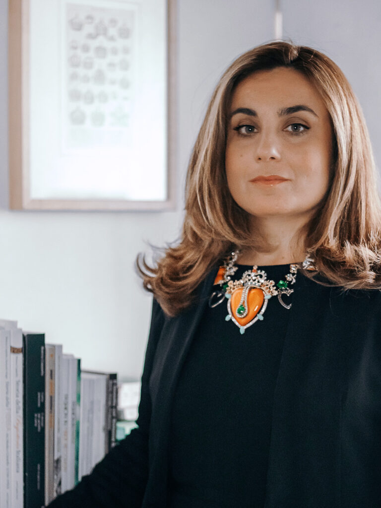
Shot in 2021.
The obvious approach was a portrait. Historian at a desk, arms folded, looking at the lens.
I photographed her working instead. The loupe at her eye. A chain running through her fingers. Her own reference library behind her, the spines legible, because those books are the argument.
A historian’s asset is her attention. You cannot photograph expertise, but you can photograph someone looking closely, and a viewer reads the rest.
Her own library. The spines are the argument.
2021.
The Website
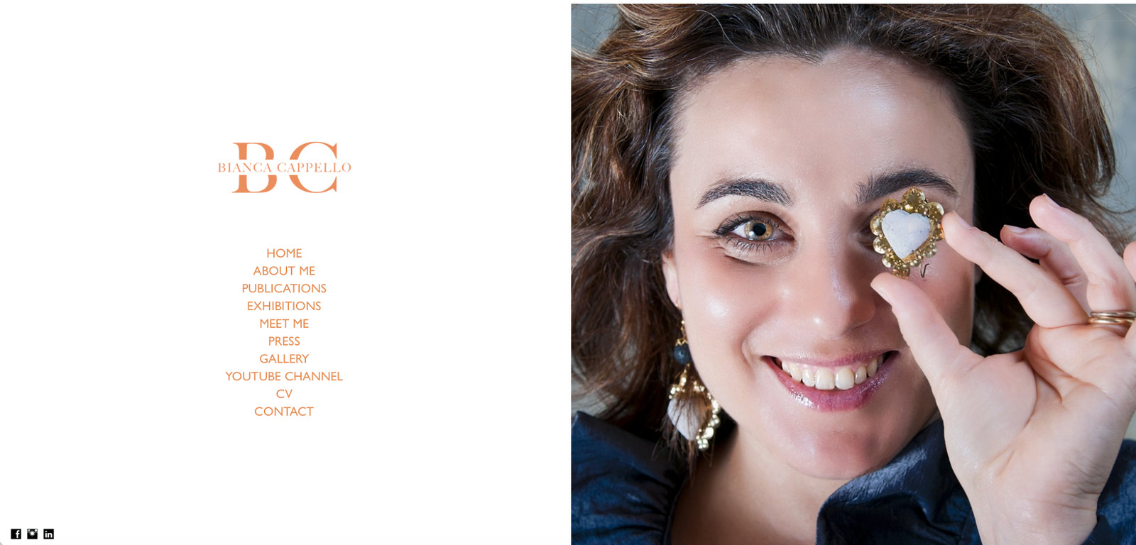
Split screen. The mark and the navigation on the left, a single full-height photograph on the right. No hero copy, no tagline, no scroll before the first idea arrives.
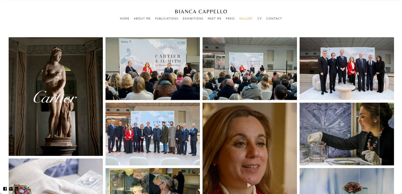
The colour carries the whole interface. Nothing else on the page is coloured.
Every page. Home, About, Publications, Exhibitions, Press, Gallery, CV, Contact.
Seven years on, the mark has not changed. I still update the site when she needs it.
Three years after this project, Bianca curated an exhibition at the Museo del Bijou di Casalmaggiore and asked me to design the display. She asked again the following year.